
The Heritage Foundation was recently recognized for its effective infographics and internet design by Graphic Design USA. Heritage won three awards for its digital products, beating out over 10,000 other entries.
The first award was for internet design, given in recognition of Heritage’s numerous digital products focused on COVID-19, including seven interactive maps, five interactive charts, and one calculator.
The pandemic made 2020 a busy year for Heritage data visualizations. Heritage’s research team and web designers analyzed a wide range of datasets and used that data to craft useful resources for both policymakers and the general public. In each case, the goal was to design an intuitive format that would allow the user to make sense of the data quickly.
![]()
“Heritage has a world-class research team, and there are some great opportunities to produce data visualizations that support our policy arguments,” said John Fleming, manager of data graphics. “Working collaboratively with our researchers, directors, and web developers is gratifying.” Jay Simon, senior designer and web developer at Heritage added, “Heritage’s research editing team puts an enormous amount of work into data visualizations. We strive to create accessible, easily comprehensible content that allows the average American to understand some of the most complicated and pressing issues of the day. These awards recognize the tremendous talent working towards that goal, and we are very grateful for the recognition.”
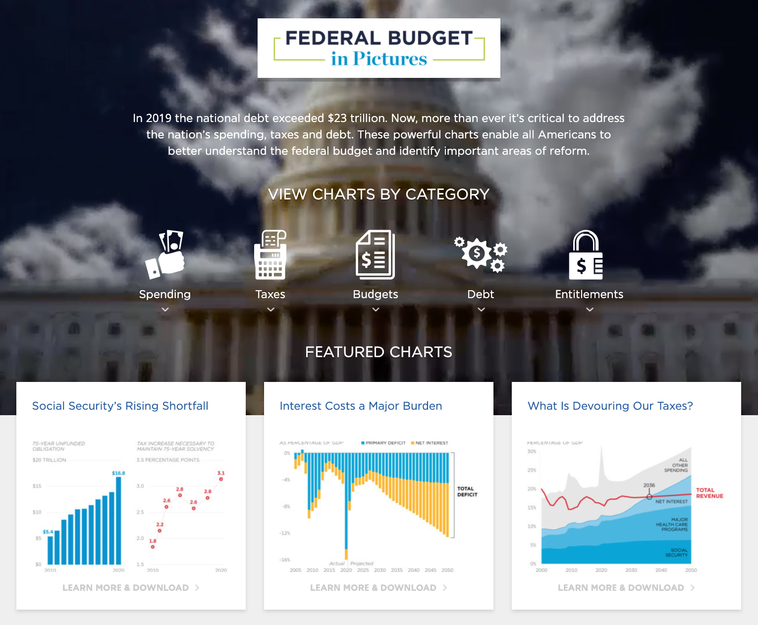
Heritage also received an award for best infographics for its “Federal Budget in Pictures.” The project began in 2008 as a new kind of publication: a collection of data graphics combining visuals with succinct analysis to provide readers with clear insights about the history, current status, and outlook of the federal budget. Each graphic stands on its own and focuses on a specific issue related to revenue, taxes, and spending.
Initially, “Federal Budget in Pictures” was designed as a printed booklet that contained more than 40 charts. In 2009, a web version was added, including downloadable charts for blogs and presentations, video explainers, and Heritage's first interactive web graphic.
“Federal Budget in Pictures” is revised and refined regularly by adding new charts and removing others. The current iteration contains more than 50 data charts that are updated online over the course of the year.
The final award, for internet design, recognized the excellence of the latest Heritage annual report.
A yearly digest of the prior year’s research, policy victories, and accolades, the annual report also profiles a selection of Heritage employees who embody the organization’s mission statement of “building an America where freedom, opportunity, prosperity, and civil society flourish.”
The 2019 annual report, titled “Principled Leadership in a Challenging World,” won an award for internet design for excellence in structure and navigation, functionality and interactivity, visual creativity, design innovation, design impact, and overall experience.
Earlier this year, the University of Pennsylvania’s “Global Go To Think Tank Index” ranked Heritage the No. 1 think tank in the world for best use of the internet. Data visualizations are a big reason why.
Heritage project coordinator Isabel Isidro said the popularity and reach of these online products show they are having an impact, specifically when it comes to conveying information about COVID-19.
“Heritage is now No. 2 in the list of search results on Google just behind our data source, the CDC, and we’re the No. 1 result via Bing, DuckDuckGo, and Yahoo,” she noted. “This amount of traffic is an incredible achievement considering the global interest in this particular topic. Of the litany of resources out there, ours has risen to the top—meaning our visualizations are being viewed by tens of thousands of unique users.”