Class warfare has always been a mainstay of liberal politics. Politicians frequently depict the United States as a nation starkly divided between the rich and poor. For example, vice presidential candidate John Edwards decries "two Americas...one privileged, the other burdened...one America that does the work, another that reaps the reward. One America that pays the taxes, another America that gets the tax breaks."1
How accurate is this characterization? How unequal is the distribution of economic resources in our society? This paper will attempt to answer these questions. Specifically, it will seek to provide:
- A clearer understanding of the existing level of income equality in U.S. society, and
- An appreciation of the social and economic forces contributing to existing inequality.
Census Figures on Income Distribution
This paper analyzes the existing distribution of income in the United States. The term "income" refers to new revenues and economic resources received by individuals and families during the course of a year.2 The distribution of annual income is thus distinct from the distribution of wealth, which refers to economic assets saved from prior years.
Discussions of income distribution usually begin with annual data provided by the Census Bureau. To measure income distribution, the Census Bureau first ranks households from highest to lowest income. It then divides society into five groups, called quintiles, and determines the share of total income received by each quintile.3
On the surface, the Census figures appear lucid and easily understandable. However, the conventional Census data are marred by four problems that lead to an overstatement of the level of economic inequality:
- Conventional Census income figures are incomplete and omit many types of cash and non-cash income.
- The conventional Census figures do not take into account the equalizing effects of taxation.
- The Census quintiles actually contain unequal number of persons, a fact that greatly magnifies the apparent level of economic inequality.
- Differences in income are substantially affected by large differences in the amount of work performed within each quintile, yet these differences in work effort are rarely acknowledged.
An Accurate Picture of the Distribution of Economic Resources
This paper analyzes the distribution of income in the United States based on data taken from the Census Bureau's Current Population Survey (CPS) from March 2003 (covering incomes for 2002).4 Income distribution data change very little from one year to the next; therefore, the conclusion reached in this paper would apply with little change for incomes in 2003.
The paper presents data on income distribution in four separate stages:
Stage 1: Conventional Income Distribution Data
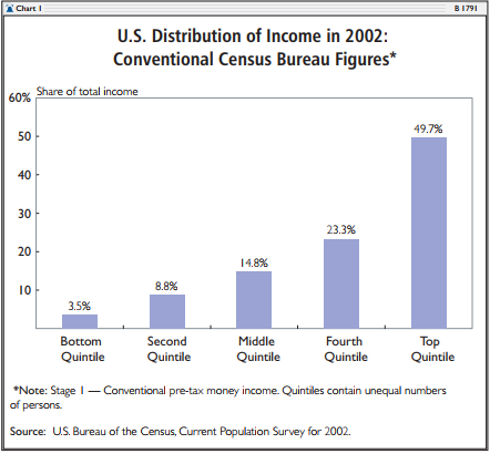
As noted, the Census presents income distribution by dividing U.S. households into five groups or quintiles. The share of total income going to each quintile is then determined. The conventional quintile distribution of income for 2002 is shown in Chart 1. In that year, the Census reported that the top or most affluent quintile had 49.7 percent of income, while the bottom quintile had only 3.5 percent. Thus, the top fifth of households is shown to have 14.3 times more income than the bottom fifth.5


Stage 2: Impact of taxes and Non-Cash Benefits on Economic Equality
The conventional Census income distribution data are based on the concepts of "money income." Money income includes earnings, interest, dividends, rents, Social Security retirement benefits, pension or retirement income, survivors' benefits, disability benefits, veterans' benefits, workers' compensation, alimony, and some cash welfare benefits.
Despite this list, it is now widely acknowledged that the Census money income figures grossly underreport the economic resources available to the American people.6 For example, the aggregate "money income" figures reported by the Census in 1996 equaled only 70 percent of the comparable personal income figures reported in the Commerce Department's National Income and Production Accounts (NIPA), which serve as the basis for measuring gross national product.7
Increasingly, Americans receive "non-cash" incomes that are not included in the Census income distribution figures based on "money income." For example, many Americans receive health insurance from their employers. Such insurance is an important augmentation to salaries. Families who have health coverage are clearly better off, ceteris paribus, than those who must pay health costs out of pocket.
Similarly, the poor and the elderly receive extensive and costly non-cash benefits from the government. In 2002, the government spent $522 billion on means-tested aid to the poor and the near poor.8 This aid included cash, food, housing, medical care, and social services such as subsidized day care. Virtually none of this assistance was included in the Census income distribution figures. In the same year, the government spent $257 billion subsidizing medical care for the elderly through the Medicare program; this assistance was also ignored in the Census income distribution figures.
The social safety net represents a massive transfer of economic resources away from affluent families and toward the less affluent. Each year, the government taxes higher-income families and transfers economic resources to the poor and elderly through means-tested welfare and Medicare. Overall, the resources transferred in this manner are over $750 billion per year, or more than 8 percent of total personal income. Yet almost none of this massive redistribution of economic resources is recorded in the conventional Census income distribution figures shown in stage 1.
Fortunately, the Census Bureau's annual Current Population Survey (CPS) collects data on taxes and on the receipt of many additional types of income beyond those included under "money income." While these additional income data are excluded from the Census' conventional (stage 1) income distribution figures, which are based on "money income" only, they are available to researchers in electronic form. We have used these excluded data as the basis for the analyses provided in this paper.9
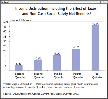
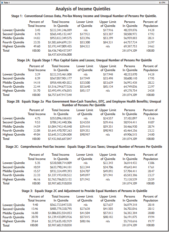
Table 1 shows the effects of incorporating a more complete count of income and taxes on the distribution of income. Adjustments to income are presented in sub-stages. First, capital gains and losses are added (stage 2A). This adjustment raises total annual income by some $320 billion and increases income inequality. Next, employee health benefits and government non-cash transfers are added (stage 2B). Government transfers include the earned income tax credit, food stamps, school lunch programs, public housing, Medicaid, and Medicare. Medicaid and Medicare benefits are counted at their insurance or market value, which equals the average government expenditures on benefits to individuals in specific age and risk categories. These adjustments add nearly $700 billion to the total annual income and decrease income inequality. Finally, the effects of federal income tax, state income tax, and Social Security taxes are shown in stage 2C. This adjustment reduces annual total income by some $1.4 trillion and markedly decreases inequality. We term the income figures in stage 2C "comprehensive post-tax income."10

Inclusion of taxes and non-cash aid substantially reduces economic inequality. In stage 1, the bottom quintile was shown to have 3.5 percent of total income; by stage 2C, this number had risen to 5.35 percent. The income share of the top quintile falls from 49.6 percent in stage 1 to 46.16 percent in stage 2C.
Stage 3: Adjustment of Quintiles to Contain Equal Numbers of Persons
When decision-makers, journalists, and the public view the government's official income distribution figures, there is a common and implicit assumption that the quintiles contain equal shares of the population. After all, the notion that we should measure "inequality" by comparing the aggregate income of groups that are themselves unequal in size is at best confusing. However, as noted, the official Census income "quintiles" do not contain equal shares of the population, and this fact skews the Census' measure of income distribution.
No one would think it valid to measure inequality between New York State and Delaware by simply comparing the aggregate incomes in the two states. In such a comparison, income differences would mainly reflect vast differences in state populations. But the Census makes precisely this sort of unbalanced comparison whenever it compares quintiles of unequal size.
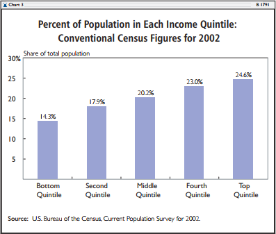
Chart 3 shows the percent of the population contained within each Census "quintile." While the middle quintile does contain roughly one-fifth of the population, the others do not. The high disparity in population between the highest and lowest income quintiles is of particular interest. The top quintile contains 24.6 percent of the population, but the bottom quintile contains only 14.3 percent. In raw numbers, there are 69.4 million persons in the top quintile compared to 40.3 million in the bottom. Thus, for every person in the lowest quintile there are 1.7 persons in the top quintile. This imbalance in population is a major factor contributing to the apparent levels of inequality in Census Bureau figures.
The Census Bureau quintiles are unequal in size because they are based on a count of households rather than persons. A household is defined as a person or group of persons living in a single housing unit. In the United States, high-income households tend to be married couples with many members and earners. Low-income households tend to be single persons with little or no earnings. Thus, it should be of no surprise that the average household in the Census' top quintile contains 3.2 persons, while the average household in the bottom quintile contains 1.8 persons.
The typical Census practice of measuring inequality by comparing aggregate incomes between "quintiles" that contain widely differing numbers of persons can be extremely misleading. To a considerable degree, the relative poverty of the Census' official bottom quintile shown in Chart 1 results from the simple lack of people within the quintile rather than from economic factors.
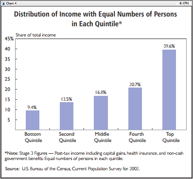
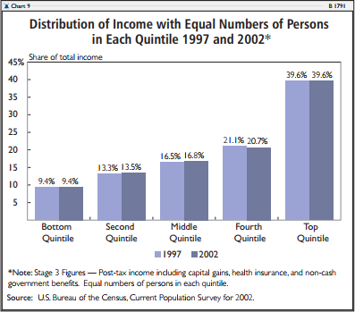
A far clearer picture of income inequality can be obtained by adjusting the quintiles so that each actually contains 20 percent of the population. In Chart 4, incomes have been corrected to include taxes and non-cash benefits, and the quintiles are adjusted to contain equal numbers of persons. As a result, the income share of the bottom quintile rises to 9.4 percent of total income and the share of the top quintile falls to 39.6 percent.
Stage 4: Inequality of Income and Inequality of Work
Counting taxes and safety net benefits while balancing the quintiles to contain equal shares of the population dramatically transforms the picture of inequality in the United States. However, it is possible to probe the issue even further.

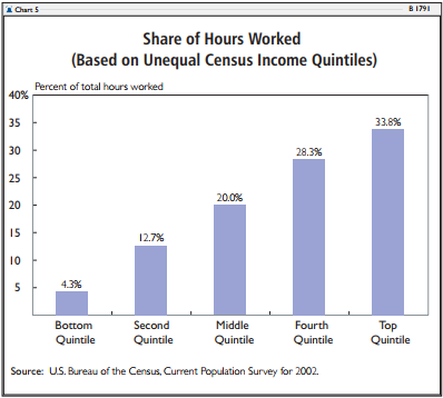
 In many respects, economic inequalities between the quintiles are a direct reflection of disparities in work performed. Chart 5 reverts to the conventional Census quintiles with unequal numbers of persons. The chart shows the total annual hours of paid labor in each quintile. In 2002, individuals in the bottom quintile performed 4.3 percent of all the work in the U.S. economy, while those in the top quintile performed 33.9 percent. Thus, the top quintile performed almost eight times as much labor as did the bottom quintile.
In part, the low levels of paid employment in the bottom quintile reflect the low numbers of working-age adults (ages 18 to 64) within the group. In the conventional Census figures (with unequal quintiles), the bottom quintile contains only 11.2 percent of all working-age adults, while the top quintile contains 27.6 percent. Not only does the bottom quintile contain fewer adults of working age, but each adult, on average, works fewer hours during the year than does his counterpart in the higher-income quintiles. On average, working-age adults in the bottom quintile worked about half as many hours during the year as did adults in the top quintile. The combination of relatively few working-age adults and low levels of work per adult contributes significantly to the low income levels in the bottom quintile.
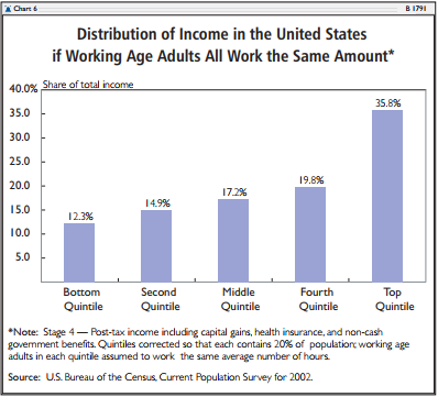
The stage 4 analysis shows what the distribution of income would be if working-age adults in the bottom quintile worked as many hours as those in higher-income families. In contrast to the adjustments in stages 2 and 3, stage 4 represents a hypothetical rather than an actual condition, since the non-elderly adults in the bottom quintile clearly do not work as much as higher-income adults.
The stage 4 figures incorporate the adjustments made in stages 2 and 3 before making the hypothetical adjustments in hours of work. The results are presented in Chart 6. The working-age adults in each quintile are assumed, on average, to perform equal hours of paid labor during the year. The outcome would be a substantial equalization of incomes. The income share of the bottom quintile would rise to 12.3 percent, while that of the top quintile would fall to 35.8 percent.
Ratio of Incomes Between the Top and Bottom Quintiles
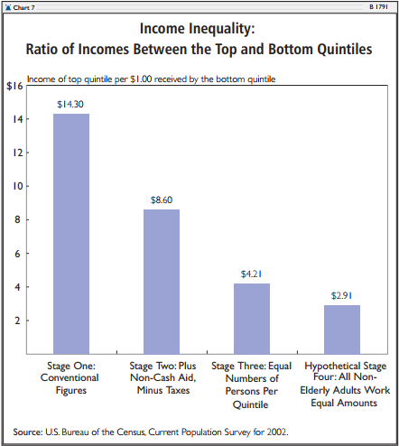
Chart 7 summarizes the ratios of income of the top quintile compared to the bottom quintile in various scenarios. In the conventional figures from stage 1, households in the top quintile appear to have, on average, $14.30 of income for each $1.00 of income in the bottom quintile. When the impact of taxes and non-cash benefits is included in stage 2, the ratio falls to $8.60 in the top for each $1.00 in the bottom. If the quintiles are then corrected to contain equal numbers of persons, the ratio falls to $4.21 to $1.00. Finally, if the annual work levels of working-age adults in each quintile were hypothetically made equal, the income ratio of the top to the bottom would fall to $2.91 to $1.00.
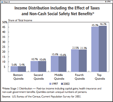
Increasing Inequality
 A frequent complaint is that the distribution of income is becoming less equal over time. There is some merit to this charge: According to conventional Census numbers, the income share of the top fifth of households rose from 43.7 percent of total income in 1980 to 49.7 percent in 2002. But nearly all of that increase occurred in the 1980s and mid-1990s. For the past five years, the distribution of income has remained static, as charts 8 and 9 show. A tiny increase in the income share of the top quintile corresponds to a small increase in the share of population and total work occurring within the quintile. After adjusting quintiles to contain equal numbers of persons, the top quintile in 1997 had $4.22 in post-tax, post-benefit income for every $1.00 of similar income at the bottom.11 In 2002, the ratio was $4.21 to $1.00.
The conventional Census figures also suggest that the incomes of the two poorest quintiles have fallen over the past 30 years. The Census reports that in 1970, the two poorest quintiles had 14.9 percent of all money income. By 2002, the figure had fallen to 12.3 percent. However, this apparent decline is a result of the exclusion of non-cash benefits from the count of income. Means-tested welfare and Medicare has risen greatly over time, from 1.5 percent of total personal income in 1950 to over 8 percent in 2002. If these benefits were properly included in the income count, the income share of the two poorest quintiles would be shown to have risen considerably in the 1960s and to have remained relatively unchanged over the past 30 years.


Conclusion
The Census income distribution figures are the foundation of most class-warfare rhetoric. On the surface, these figures show a high level of inequality: The top fifth of households have $14.30 of income for every $1.00 at the bottom.
However, these figures are flawed by the exclusion of taxes and social safety net spending and by the fact that the "fifths" do not contain equal numbers of people. Adjustment for these factors radically alters the picture of income distribution: The top fifth of the population has $4.21 of income for every $1.00 at the bottom.
The remaining inequality in society is heavily influenced by the lack of work at the bottom. If working-age adults in the lower quintiles worked as much as their higher-income counterparts, the income disparity of the top to the bottom quintiles would fall to $2.91 to $1.00.
Still, the top fifth of U.S. households (with incomes above $84,000) remain perennial targets of class-warfare enmity. These families, however, perform a third of all labor in the economy. They contain the best educated and most productive workers, and they provide a disproportionate share of the investment needed to create jobs and spur economic growth. Nearly all are married-couple families, many with two or more earners. Far from shirking the tax burden, these families pay 82.5 percent of total federal income taxes and two-thirds of federal taxes overall. By contrast, the bottom quintile pays 1.1 percent of total federal taxes.12
In one sense, John Edwards is correct: There is one America that works a lot and pays a lot in taxes, and there is another America that works less and pays little. However, the reality is the opposite of what Edwards suggests. It is the higher-income families who work a lot and pay nearly all the taxes. Raising taxes even higher on hard-working families would be unfair and, by reducing future investments, would reduce economic growth, harming all Americans in the long run.
Robert Rector is Senior Research Fellow in Domestic Policy Studies, and Rea S. Hederman, Jr., is a Senior Policy Analyst in the Center for Data Analysis, at The Heritage Foundation.
This paper examines the distribution of income and income inequality with data extracted from the Current Population Survey for the year 2002, conducted in March 2003. Like the Census Bureau, this paper studies income at the household level. Group quarters are not included in this survey. The authors also used data extracted from the Heritage Income Tax Model, which contains a sample of actual tax returns designed to replicate the total tax returns received by the Internal Revenue Service. In general, this study does not account for the underreporting of income to the Census Bureau.
Post-Tax Income
Comprehensive post-tax income includes money income plus realized capital gains, the earned income credit, employer-provided health insurance, school lunch benefits, food stamp benefits, government rent subsidies, Medicaid, and Medicare benefits. Federal and state income taxes, payroll taxes, and property taxes are subtracted. Income variables that were given only at the family or person level were aggregated to the household level. Thus, all FICA taxes paid by a household were added together by person and then subtracted from the household's final income. Food stamps and other family-level income data were treated in the same manner.
Comprehensive post-tax income is very similar to the Census income "definition 14" as detailed in the Census Bureau's Current Population Reports, Income, poverty and Valuation on Noncash Benefits, except that it employs the basic market or insurance value for Medicaid and Medicare without the "fungible" adjustment.13 The insurance value of Medicaid and Medicare (also called the market value) equals the average net government outlay for persons of a specific risk class within a given state. The risk classes used are elderly, disabled persons, non-disabled adult, and non-disabled child. Under this approach, the value of Medicaid or Medicare equals the average cost to the government of medical services provided to a given class of persons; it does not report specific medical expenditures for particular individuals.
The fungible method of valuing Medicare and Medicaid begins with the insurance value of benefits but then alters the values based on the family's income class. The full insurance value is assigned to benefits received by the middle class, but a lower value or zero value is assigned when the same benefits are received by a low-income household. The fungible adjustment was devised for the measurement of poverty, not income distribution. In measuring poverty, it is used to determine whether a household's income should be considered above the poverty threshold. However, the fungible adjustment, which deliberately reduces the value of benefits received by low-income groups, is not appropriate for the measure of income equality that seeks to compare the economic resources of one household relative to others. The fungible adjustment results in a substantial undercounting of government transfers to low income groups.
Top Coding
An adjustment was made to compensate for the Census' top coding restriction. Top coding limits the maximum value of capital gains reported in the CPS to $99,999. With normal CPS data, capital gains values that exceed this limit are simply reported as $99,999. In order to obtain a more thorough estimate of high levels of capital gains income, we have replaced those capital gains values subject to the top coding restriction with higher values taken from Internal Revenue Service data. This adjustment was made in the following manner: The Heritage Tax Model was used to determine the mean amount of capital gains income for those returns that reported capital gains income above $99,999. The new mean amount of capital gains was substituted to replace each CPS top-coded value of capital gains. As a result, the amount of capital gains income in the study was increased substantially. These adjustments mainly increase reported incomes in the top quintile.
Ranking
Adjustments to income in stages 2 and 3 were performed at the level of individual households. After each adjustment, the households were re-ranked based on their new income figures. Households then were weighted according to the CPS household weight variable. The stage 4 adjustments are more general; earnings were adjusted at the quintile level based the aggregate earnings and average labor data within the quintile.