The prevailing narrative about the COVID-19 pandemic is that New York and the Northeast were especially hard hit during the spring but that lockdown orders and diligent social distancing subdued the contagion.REF In the meantime, much of the rest of the country, especially in the South, relaxed lockdown orders too soon, leading to uncontrolled outbreaks throughout the region, comparable to what occurred in New York last spring.
White House Coronavirus Task Force chief Dr. Deborah Birx recently summarized this narrative: “I just want to make it clear to the American public,” she recently proclaimed, “what we have right now are essentially three New Yorks,” referring to Florida, Texas, and California.REF
But a closer look at the data reveals that when it comes to COVID-19, there is only one New York.
Despite the well-documented increase in cases throughout the South and West during the summer months, the New York City metropolitan statistical area (MSA), comprising the city itself and surrounding counties in New York State and New Jersey, has a population-adjusted confirmed case rate that is 65 percent higher than that of the rest of the nation. Its COVID-19 death rate per million residents is more than five times the rate of the rest of the country. The New York City MSA’s death rate is nearly twice that of its nearest rival, Detroit, and triple that of Phoenix and Miami, two MSAs that have seen substantial increases in cases during the summer.
New York City, where the coronavirus established an early beachhead and from there metastasized to every corner of the nation, stands virtually alone in terms of severe morbidity and mortality associated with the coronavirus.REF Although it remained largely locked down between March and late July, its case and death rates, adjusted for population, remain worse than most places in the country that reopened during the spring, including those that experienced spikes in cases over the summer.REF
Moreover, recent studies, including one by a former Obama Administration economic adviser, call into question the widely held view that lifting lockdown orders caused people to behave in ways that led to a surge in cases.REF The study found that the issuance and withdrawal of lockdown orders has only a marginal effect on people’s decisions to frequent public places.REF
Distinguishing between this summer’s outbreaks and those that occurred in the Northeast last spring, and understanding the effect of lockdown orders on people’s behavior, are critical to formulating effective public health strategies to control COVID-19’s devastation.
Metropolitan Statistical Areas (MSAs)
This paper looks at the MSAs of the six cities that have recorded the most deaths related to COVID-19.REF MSAs, created by the U.S. Office of Management and Budget and used by the Census Bureau, comprise areas that extend beyond the borders of the city. The Census Bureau defines an MSA as “a core area containing a substantial population nucleus, together with adjacent communities having a high degree of economic and social integration with that core.”REF
The New York City MSA, for example, includes counties in New York State, New Jersey, and Pennsylvania. People living within the New York MSA may work in the city, use its public transportation system, and frequent its restaurants, shops, museums, and theaters. The political boundaries of the city itself thus fail to capture the complex web of daily human interactions that occur within the New York MSA as a whole, interactions that can facilitate the spread of the coronavirus.
A more complete way to assess the pandemic is to compare the MSAs of the cities reporting the highest numbers of cases and deaths on a population-adjusted basis. This comparison allows for an assessment of the impact of those MSAs on national and state infection and death rates.
Comparing the Leading COVID-19 MSAs
Deaths per Million Residents. Chart 1 applies this method of comparison to the six MSAs that recorded the largest numbers of COVID-19-related deaths per million residents as of August 22, according to USAFacts.org.REF
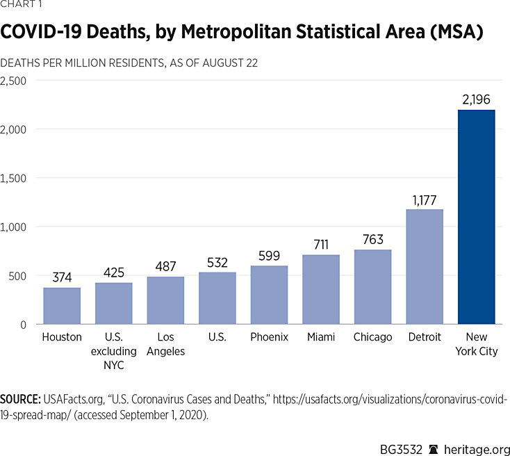
The chart illustrates one way of comparing the outbreak that occurred during the spring in New York with those that were roughly contemporaneous (Chicago and Detroit) and those where cases spiked during the summer (Los Angeles, Miami, Houston and Phoenix). The death rate of 2,196 per million residents recorded in the New York City MSA is almost twice that of its nearest rival (Detroit, 1,177).
The gap between New York City’s COVID-19-related death rate and that of cities that have experienced more recent outbreaks is even more pronounced. New York City’s death rate is more than triple that of Phoenix and Miami—two cities that have recorded higher rates of infection than New York. It is 4.5 times that of Los Angeles and nearly six times that of Houston.
New York City has also exerted an outsized influence on the national COVID-19-related death rate. Through August 22, it accounts for one in four COVID-19-related deaths in the United States. The nation’s death rate is 532 per million when New York City is included. That is 25 percent higher than the death rate that excludes New York City (425 per million). Removing New York City’s deaths would move the United States from eighth place in the world in deaths per million to 13th place.REF
And although the incidence of new COVID-19 cases in the New York City MSA has been moderate in recent months even as the rate of infection surged through many parts of the country, New York City’s COVID-19-related deaths per million residents (2,196) is still more than five times that of the rest of the nation (425).
Assertions that the pandemic is now as bad or worse than New York in Florida, Arizona, Texas, and California are thus misleading in part because they overlook these stark differences. Despite the surge in cases in these other cities, it is highly unlikely that any of them will record anything approaching New York City’s death toll. Indeed, Miami and Phoenix have higher population-adjusted cases than New York, with population densities 76 percent lower and 86 percent lower, respectively, than New York’s.REF
Cases per Million Residents
New York City fares slightly better when compared against other MSAs on the basis of COVID-19 cases per million residents, as Chart 2 shows.
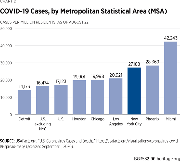
In recent months, Miami and Phoenix have surged past New York City on this metric. More than 4.2 percent of Miami-area residents had tested positive for the coronavirus (42,243 per million) as of August 22.
It is nevertheless significant that New York City remains in third place among U.S. MSAs and well ahead of case rates in Los Angeles, Chicago, and Detroit because the summer surge in cases that has garnered so much attention had a relatively small effect on New York City’s standing.
More remarkable is a comparison between the New York City MSA case rate per million population and that of the rest of the United States. Even taking into account every positive test that has been reported throughout the country through August 22, the NYC MSA case rate (27,188) is 65 percent higher than the rate for the remainder of the United States (16,474).
How MSAs Affect State COVID-19 Infection and Death Rates
Just as New York City remains among the nation’s leaders in COVID-19 cases and deaths, the coronavirus remains a disproportionately urban disease. A comparison between a state’s case and death rates with and without a leading MSA illustrates how the disease is concentrated in urban areas.
Chart 3 illustrates this point by showing the effect of New York City on New York State’s case and death rates.
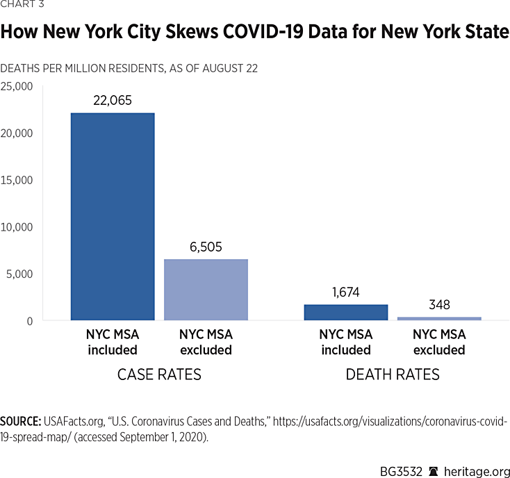
The first set of two bars take the New York State COVID-19 cases per million residents as of August 22 when counties in the New York MSA are included and compare it with the rate when those counties are excluded. The difference is dramatic. The overall case rate for New York State plummets by 71 percent (22,065 to 6,505) to a level that is well below the national average. The state moves from sixth in case rate among U.S. states to 42nd place once the New York MSA is removed.REF
The second set of bars makes the same comparison with respect to COVID-19-related deaths per million population. Removing counties in the New York MSA from the calculation drops the death rate for New York State to 348 per million, nearly 80 percent lower than the state’s rate when the New York City MSA is included (1,674). That is well below the national average and would move New York State from second place to 23rd place in deaths per million.REF
This new ranking suggests that the pandemic affected most counties at a rate that was far lower than the overall numbers suggest.
Removing the New York City MSA from New Jersey’s statistics has a similar, though less pronounced, effect, as Chart 4 shows.
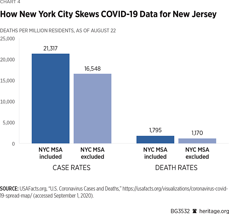
When counties belonging to the New York City MSA are removed from the calculations, New Jersey’s case rate drops by 22 percent to 16,548 and below the national average, moving it from 10th place to 23rd.REF Its death rate (1,170), however, drops the state to fifth place from first in this category.REF
One reason New Jersey’s death rate far exceeds the national average is because so many of its counties in the southern part of the state belong to the Philadelphia MSA. New Jersey is unique in that none of its counties are considered rural under the definition developed by the Office of Management and Budget.REF
The geographic concentration of COVID-19 cases and deaths, often thought to be a relic of the early days of the pandemic before the contagion spread more broadly, is not strictly limited to these MSAs.
As of August 22, the 50 counties with the most COVID-19 deaths (just 1.6 percent of all U.S. counties) account for 51.7 percent of the deaths in the United States.REF That figure is slightly more than double those counties’ share of the U.S. population (24.9 percent). In contrast, 65 percent of all U.S. counties, representing 15 percent of the U.S. population, have recorded 10 or fewer COVID-19 deaths—less than 3 percent of the national total.
COVID-19 Death Rates Are Much Lower Than During the Spring
Just as the New York City MSA fits a broader pattern of the pandemic’s continued urban concentration, its disproportionate death rate suggests that the lethality of COVID-19 is much lower today than in the pandemic’s earliest days.
The reasons for this difference are not entirely clear. New York City is a global transportation hub, exposing it more rapidly and extensively to travelers who may have carried their infections from China and Europe. The busiest commuter rail in the nation runs through Manhattan and serves 23 of the 30 U.S. counties with the most COVID-19 deaths (all in the Northeast corridor between Philadelphia and Boston).REF
Testing likely also plays a role. In the pandemic’s early stages, public health officials had little information about the extent of the contagion’s community spread. Tests developed by the Centers for Disease Control and Prevention proved faulty, and the agency was slow to recover from its error.REF During March, public health officials were unaware that the pathogen was silently spreading in New York, since they lacked the means to test patients.REF Testing, though still somewhat chaotic, has improved since then, enabling better-informed public health interventions.
State and city officials also relied heavily on pandemic modeling that proved highly inaccurate. The Institute for Health Metrics and Evaluation, based at the University of Washington, “predicted” on April 5 that New York would need 69,000 hospital beds and 10,000 ventilators to accommodate the influx of COVID-19 patients on that day.REF It turned out that there were 16,500 patients hospitalized and 4,000 ventilators in use on April 5.REF
New York thus suffered from both a lack of information attributable to poor testing and a surfeit of bad information attributable to unreliable models. That combination no doubt contributed to the state’s ineffectual response.
The state’s early decision to require nursing homes to accept COVID-19 patients discharged from hospitals may have also driven up infections among those most susceptible to COVID-19-related death.REF The effect of that policy is difficult to assess, since the state did not classify the deaths of nursing home residents who died in hospitals as nursing home deaths.REF However they were classified, it appears that nursing home deaths account for a substantial share of the state’s COVID-19 mortality.REF
While all of these factors plausibly contributed to New York City’s disproportionate number of COVID-19-related deaths, they do not offer a satisfactory explanation of why cities reporting higher rates of infection (Miami and Phoenix) have much lower rates of pandemic-related death. It is clear that this summer’s increase in COVID-19 cases has not produced mortality rates that approach those of New York City. It is simply inaccurate to equate other cities in which outbreaks have occurred with New York City.
The Role of Lockdowns
That false equivalence is nonetheless deeply rooted in the popular media, as is its putative cause—the “premature” lifting of government lockdown orders. More specifically, the theory is that much of the rest of the country is now suffering New York City’s fate because its leaders relaxed lockdowns “too soon.”REF This theory inevitably is couched in political terms, suggesting the Republican Governors of Florida, Georgia, Arizona, and Texas succumbed to pressure from President Trump to ignore “science” and allow “non-essential” businesses to reopen. Those decisions, it is widely believed, turned cities throughout the South into the equivalents of New York City.
We have already dealt with the false equivalence between Phoenix or Miami with New York. But there is also considerable empirical evidence that the relaxation of lockdowns had substantially less effect on public behavior than is widely assumed.
Former Obama Administration economic adviser and University of Chicago professor Austan Goolsbee was the lead author of a study that took a closer look at the collapse of economic activity that occurred last spring and concluded that the enforcement or relaxation of lockdowns had a relatively small behavioral effect.REF
Using mobility data, Goolsbee and his coauthor Chad Syverson examined foot traffic among 45 million cellphone users at 2.25 million individual businesses in 110 industry groupings between March 1 and May 16. Those dates encompass the period before lockdowns took effect, the period during which 42 states enforced lockdowns, and the period during which some states began to relax them.
They found that the decline in foot traffic hit 60 percentage points at its trough on April 12, ranging from a 99 percent decline in theaters and dinner theaters (which lockdown orders typically shuttered) to a slight increase in outdoor power equipment stores at the other extreme.
The authors then set out to examine how much of the decline was attributable to legal restrictions and how much owed to fear of contagion among the public. They found, first of all, that declines in economic activity occurred in many counties before the lockdown orders took effect. That reduction was largely explained by a spike in reported COVID-19-related deaths in a county. When deaths occurred locally, people curtailed their own activity without waiting for a government shelter-in-place order.
The authors also examined how shutdowns in adjacent counties—one located in a state that imposed a shelter-in-place order and the other in a state that did not—affected consumer behavior. Taking this and other factors into account, they concluded that only 7 percentage points of the 60 percentage point reduction in economic activity was due to government shelter-in-place orders:
While overall consumer traffic fell by 60 percentage points, legal restrictions explain only 7 of that. Individual choices were far more important and seem tied to fears of infection. Traffic started dropping before the legal orders were in place; was highly tied to the number of COVID deaths in the county; and showed a clear shift by consumers toward smaller/less busy ones in the same industry.REF
It is important to note that the relatively small effect of government lockdown orders applies both to their institution and their repeal, according to the authors:
The effect of repealing a [shelter-in-place] order is statistically the mirror image of imposing one, and certainly no larger. The point estimates imply economic activity fell 8% when governments instituted the orders and rose 5% when they repealed them.REF
The study suggests that public debate over whether to impose or roll back lockdowns is somewhat misplaced. Ultimately, what matters is not whether the government institutes or lifts a lockdown but how people assess (or mis-assess) their own risk. People are more likely to restrict social and economic activities that make them more susceptible to infection when they perceive their risks to be high and to increase their activities when they perceive them to be low. While lockdown orders affect behavior at the margins, they do not appear to be primary drivers of individual decision-making, at least according to this study.REF
If these findings are correct, attributing this summer’s rise in cases in many areas of the country to the withdrawal of lockdown orders is as misguided as the suggestion that spikes in cases in these areas has created situations comparable to those in New York City.REF
This is especially true when considering how hundreds of thousands of New Yorkers responded to the lockdown orders. Many wealthier residents decamped from the city to second homes, leaving the elderly and poor behind. An estimated 420,000 residents fled the city between March 1 and May 1.REF The population of wealthy neighborhoods such as the Upper East Side, the West Village, SoHo, and Brooklyn Heights fell by at least 40 percent.REF Their migration helped spread the infection to other parts of the country.REF
People with well-paying jobs who were able to work remotely were most likely to leave and, if they lived outside the city, to avoid going there. That pattern persisted even after the lockdowns were relaxed. The government permitted offices to reopen on June 22, subject to some limitations.REF As with businesses throughout the country, most offices in the city had still not reopened as of late August.
It is impossible to determine what the death toll would have been had wealthier residents of these boroughs remained in the city or returned to their desks once the governor permitted offices to reopen during June. What is clear is that the lockdown orders themselves did not affect the behavior of New Yorkers who had options. Many vacated their homes and offices before the orders were issued and have not returned months after the government lifted its restrictions.
While the popular perception is that a months-long government lockdown “flattened” New York City’s pandemic curve, its downturn in cases may have less to do with lockdown orders than with many of its residents and office workers leaving the city behind.
Conclusion
Although the course of the pandemic has changed, with rising caseloads outside the Northeast, its essential character has not. The intensity and lethality of the pandemic in that region, especially in New York City and surrounding counties, is unrivaled by anything that has occurred since.
Measured in terms of deaths per million population, the New York City MSA remains without rival as a pandemic epicenter, accounting for 25 percent of the nation’s COVID-19-related deaths as of August 22. And while two MSAs have surpassed its confirmed cases per million, the New York City MSA’s case rate still exceeds that in the rest of the country by 65 percent.
The notion that the spread of the disease over the summer season is attributable to a relaxation of lockdowns is also tenuous. The decision to curtail social interactions appears to be a personal one, related more to the number of deaths in a person’s locality, risk assessment, and financial means than to whether the state has issued or rolled back a stay-at-home order.
The preeminence of personal choice over government policy in influencing behavior points up the need for public health leaders to provide accurate information to inform those choices. That includes information about their risk of serious illness and death from the coronavirus.
While the risk of infection is more or less evenly distributed, the risk of hospitalization and death rises exponentially with age.REF The most effective policies are those aimed at protecting people at greatest risk of severe consequences.REF
Widespread lockdown orders, school closures, and the shuttering of “nonessential” businesses appear to have only a marginal effect on behavior. Public attitudes toward the pandemic range from complacency to fear and appear to be influenced more by symbol and emotion than by data. This may in part result from public health messaging that is often inconsistent and fails to accurately describe age-related risk.
Public health officials should provide the public with solid and accurate information about their risk rather than making apocryphal pronouncements about states replicating the experience of New York.
The New York COVID-19 experience, thankfully, so far remains unique. Sound public policy will use factual communications and well-targeted interventions to keep it that way.
Doug Badger is a Visiting Fellow in Domestic Policy Studies, of the Institute for Family, Community, and Opportunity, at The Heritage Foundation. Norbert J. Michel, PhD, is Director of the Center for Data Analysis, of the Institute for Economic Freedom, at The Heritage Foundation.