Political debate on income in the United States often has been characterized as competition between two schools of economic thought: one that focuses on the long-term increase in general prosperity and one that focuses on the equalization of existing incomes. Proponents of the first approach have much to hearten them; the long-term increase in economic well-being in the United States has been enormous. Today, the standard of living for the average American is nearly seven times higher than it was 100 years ago, after adjusting for inflation.2 The large gains in prosperity have affected all Americans, including low-income groups. At present, workers earning the minimum wage comprise the lowest-paid 2 percent of all employees. Yet today's minimum wage worker earns more, in real terms, in a single day than a low-skilled worker earned in an entire six-day workweek at the turn of the century. In other words, today's minimum wage worker earns more in eight hours than a low-skilled worker earned in 70 or more hours a century ago.3
Despite this long-term improvement in living conditions, interest in the alternative approach focusing on the redistribution of incomes remains strong. Indeed, the drive to create greater economic and income equality between the apparent haves and have nots has been an enduring theme in the political realm of the 20th century. For example, the desire to level incomes was an important but deliberately unstated goal behind Lyndon Johnson's launch of the War on Poverty.4 Since its initiation in the mid-1960s, U.S. taxpayers have spent $7.9 trillion on federal welfare programs, often with lamentable social side effects. Nonetheless, the pressure toward equalizing incomes continues unabated, and the issues of economic equality are intertwined with many other public policy debates.
When considering questions of economic equality, policymakers should seek the following:
-
A clear understanding of the existing level of income equality in society, and
- An appreciation of the social and economic forces that contribute to the existing inequality.
With these issues in mind, this report analyzes the existing distribution of income in the United States. The term "income" refers to new revenues and economic resources received by individuals and families during the course of a year. The distribution of annual income is thus distinct from the distribution of wealth, which refers to economic assets saved from prior years.
Census Data.
Discussions of income distribution usually begin with annual data provided by the U.S. Bureau of the Census. To measure income distribution, the Census Bureau first ranks households from highest to lowest incomes. It then divides American society into five groups, called quintiles, and determines the share of total income received by each quintile.
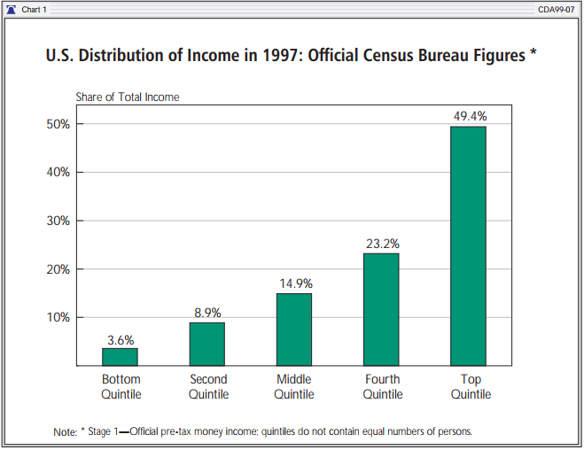
The official Census Bureau distribution of income by quintile for 1997 is presented in Chart 1. The chart shows that 3.6 percent of total income went to the lowest quintile, while the top quintile received 49.4 percent.
The Census analysis appears lucid and straightforward. However, the Census data are marred by four problems that lead to an overstatement of the level of economic inequality. These problems are:
-
The conventional Census income figures are incomplete and omit many types of cash and non-cash income.
-
The conventional Census figures do not take into account the equalizing effects of taxation.
-
The Census quintiles actually contain unequal numbers of persons, a fact that greatly magnifies the apparent level of economic inequality.
-
Differences in income are affected substantially by large differences in the amount of work performed in each quintile, yet these differences in work effort are not acknowledged in Census publications.
OVERVIEW OF INCOME DISTRIBUTION
In this section, we will address the omissions and shortcomings in the conventional Census income distribution figures and show the actual distribution of income once these corrections are made. The analysis is based on data taken from the Census Bureau's Current Population Survey (CPS) from March 1998 (covering incomes for 1997).5 In order to increase understanding of the corrections made, the adjustments are presented in four separate stages. We first discuss each stage briefly; in the subsequent sections, we discuss each stage in greater detail. The effects of the adjustments in each stage are shown in Chart 2 and Chart 3. The stages are as follows:
STAGE 1: Reporting Conventional Census Data.
Stage 1 presents conventional Census Bureau income distribution statistics based on pre-tax "official money income" and demographically unequal quintiles. Many policymakers and members of the press rely heavily on these income distribution statistics (also shown in Chart 1).6 They serve as the basis for comparison to the corrected figures described in Stages 2, 3, and 4.
STAGE 2: Adding a More Complete Count of Income and Taxes.
The conventional money income figures presented in Stage 1 exclude many types of income and compensation received by families and individuals, as well as the effects of taxes in reducing income. Stage 2 corrects for these omissions by making the following adjustments.
-
The value of realized capital gains is added to income.7
-
The value of welfare benefits such as food stamps, public housing, the school lunch program, and the earned income tax credit are added,8 as are the value of employee health benefits and the insurance values of Medicaid and Medicare benefits.9
- Federal income taxes, property taxes, state income taxes, and Social Security payroll taxes are then subtracted from family income.
In each case, the value of the benefits or income added and taxes subtracted for each family has been taken directly from the CPS.10 (The Census Bureau collects these data but does not incorporate them into its official money income totals.)
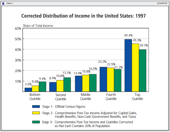
We label family income adjusted in the manner we describe above as "comprehensive post-tax income." The effects on income distribution figures that result from replacing official money income (Stage 1) with comprehensive post-tax income (Stage 2) are shown in Chart 2. The share of total income received by the bottom quintile rises from 3.6 percent to 5.6 percent. The share of the top quintile falls from 49.4 percent to 45.3 percent.
STAGE 3: Adjusting Quintiles to Contain Equal Numbers of Persons.
The largest flaw in the Census income distribution data is that its income "quintiles" do not contain equal fifths of the U.S. population, but are in fact unequal in size.11 Indeed, in reality the top Census "quintile" contains not 20 percent of the population but 24.3 percent, while the bottom quintile contains only 14.8 percent of the population. The top quintile has 65 percent more persons than does the bottom quintile. With conventional Census figures, the bottom "quintile" is hollow, representing far less than one-fifth of society; by contrast, the top "quintile" is overpopulated, containing far more than one-fifth of persons, workers, and work effort. Naturally, the demographic imbalance between the quintiles has a considerable effect on the apparent income imbalance between them.
Stage 3 uses the comprehensive post-tax income data developed in Stage 2 and then makes a demographic adjustment so that each income quintile in fact contains one-fifth of the population.12 This adjustment ensures that the economic status of each individual in the population is treated as having equal value or importance. By contrast, individuals are not treated equally in the current Census methods; in general, individuals in married couple families are underrepresented by the Census data and treated as less significant than single persons or people in single-parent families.
The effects of the Stage 3 demographic corrections are shown in Chart 2. The share of income of the adjusted bottom quintile rises to 9.4 percent, while the income of the top quintile falls to 39.7 percent. The adjustment of the underreporting of income received by the lowest quintile of the population is particularly important. With 9.4 percent of total income, the actual share of income for this quintile is nearly three times higher than the conventional Census figures show.
STAGE 4: Explaining the Remaining Variance--Hypothetical Equalization of Work Performed.
Even after the quintiles are adjusted to contain equal numbers of persons in Stage 3, there remains an enormous difference in the amount of work performed within each corrected quintile. The annual number of hours of employed labor in the top quintile is still nearly twice that in the bottom quintile. This imbalance in work certainly can be expected to contribute to an imbalance in income.
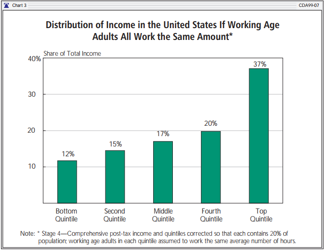
Stage 4 analyzes the effects of the imbalance of work on the distribution of income.13 It incorporates changes from Stage 2 and Stage 3 and then makes a hypothetical adjustment so that working age adults (ages 18 to 64) in each quintile are assumed to all perform the same average number of hours of paid work.14 This adjustment naturally reduces the work performed and earnings in higher quintiles and increases work and earnings in the lower quintiles. Chart 3 shows the hypothetical distribution of income that would occur if working age adults in each quintile performed the same average number of hours of annual paid labor.15 The share of income for the bottom quintile rises from 9.4 percent to 12 percent, while the share of the top quintile falls from 39.7 percent to 36.7 percent.
Comparison of the Top and Bottom Quintiles.
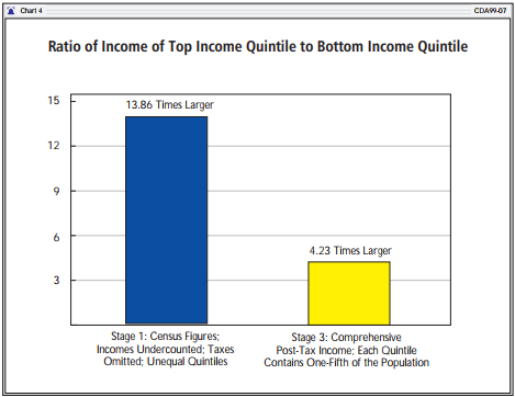
These adjustments make a great difference in the measure of apparent income inequality. For example, under conventional Census figures (Stage 1), the top "quintile" accounts for some $2.5 trillion in income in 1997, while the bottom quintile has only $181 billion. Thus, the top quintile is shown as receiving $13.86 in income for every $1.00 in the bottom. However, once incomes are more completely counted and taxes are considered (in Stage 2), the ratio drops considerably--to $8.05 for every $1.00 of income.
But even this lower ratio continues to reflect the fact that the Census data's top "quintile" is seriously overpopulated, while the bottom is underpopulated. Once the quintiles are adjusted to contain equal numbers of persons, the ratio of incomes of the top to the bottom quintile drops to $4.23 to $1.00 (as shown in Chart 4). Moreover, even this difference is due in large part to the fact that working age adults in the top quintile work twice as many hours as those in the bottom. If such adults worked the same number of hours, the income ratio would fall to around $3.07 to $1.00.
Comparison of the Top and Bottom Halves.
Chart 5 shows similar data for the top and bottom halves of the population. According to conventional Census measurement methods, the top half of society received $4.1 trillion, or 81 percent of total income, in 1997. The bottom half of society, by contrast, received $973 billion, or 19 percent of the total. As stated previously, the Census figures exclude major types of income and compensation and ignore taxes. Even more critically, under Census procedures, the top "half" contains not 50 percent of the population but 57.8 percent. The Census Bureau's top "half" contains 63 percent of working age adults who, in turn, perform 71 percent of the paid labor in the economy.
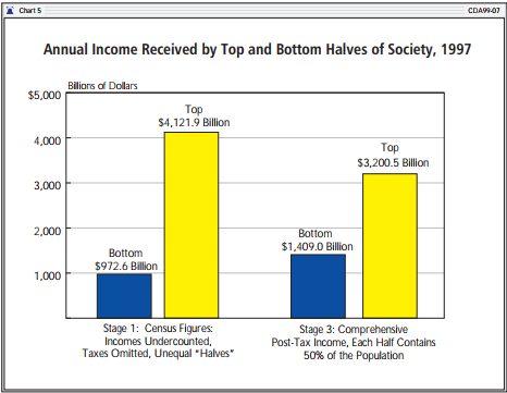
With a more accurate count of post-tax incomes and an adjustment so that the top half contains 50 percent of the population, the annual income received by the top half falls to $3.2 trillion while the share of the bottom half rises to $1.4 trillion. Thus, the conventional Census figures overrepresent the income available to the more affluent half of society by nearly $1 trillion. The share of total income received by the top half falls from 81 percent to 70 percent.
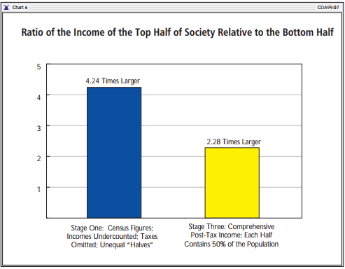
As Chart 6 shows, the Census Bureau represents the top half of society receiving $4.24 in income for every $1.00 received by the bottom half. In reality, the correct figure is $2.28 for every $1.00. The real level of inequality in the economy is effectively half that represented by the conventional Census figures.
The revised level of income equalization in the United States is quite surprising. Even after the Stage 3 population adjustments, the more affluent half of the population still provides 59.5 percent of the hours of work in the overall economy. Moreover, the top half contains the bulk of the most skilled and productive laborers and provides most of the vital investment in plant equipment, which is necessary to sustain the prosperity of all Americans. Given these realities, the 70 percent share of post-tax income going to the most affluent half of society seems remarkably low; it is striking evidence of the high degree of income equalization already occurring in American society.
DETAILED ANALYSIS:
UNDERREPORTING OF INCOME AND OMISSION OF TAXES
The conventional Census income distribution data are based on the concepts of "money income." Money income includes earnings, interest, dividends, rents, Social Security retirement benefits, pension or retirement income, survivors benefits, disability benefits, veterans benefits, workers' compensation, alimony, and some cash welfare benefits. Despite this list, it is now widely acknowledged that the Census Bureau's money income figures grossly underreport the economic resources available to Americans.16 For example, the aggregate "money income" figures reported by the Census Bureau in 1996 equaled only 70 percent of the comparable personal income figures reported in the U.S. Department of Commerce's National Income and Production Accounts (NIPA) that serve as the basis for measuring the gross national product.17
The Census Bureau's annual Current Population Survey (CPS), which serves as the basis for its income distribution data, collects data on the receipt of many additional types of income beyond those included under "money income." These additional income data, however, are excluded from Census's official income distribution figures, which are based on money income only. The Census Bureau does publish data using expanded concepts of income in technical tables in some publications; however, these tables, which offer 17 alternative definitions of income, are bewildering even to professionals in the field. Yet in its texts describing inequality, and in briefing materials given to the press, the Census Bureau continues to promote figures based on limited "money income." As a result, nearly all discussions of income inequality in the popular media and among policymakers and government officials rely on data that can be misleading.
Fortunately, the additional income data collected in the Current Population Survey are made available to researchers in electronic form, and we have used these data as the basis for the analyses provided in this report.
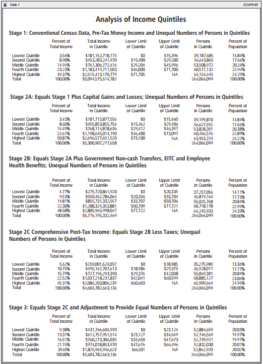
Table 1 shows the effects of incorporating a more complete count of income and taxes. (This is the same as the Stage 2 adjustment made earlier, except that the adjustments are shown in greater detail.) First, capital gains and losses are added (Stage 2A). This adjustment raises total annual income by some $200 billion and increases income inequality. Next, employee health benefits and government transfers are added (Stage 2B). Government transfers include the earned income tax credit, food stamps, school lunch programs, public housing, Medicaid, and Medicare. Medicaid and Medicare benefits are counted at their insurance or market value, which equals the average government expenditures on benefits to individuals in specific age and risk categories. These adjustments add nearly $500 billion to the total annual income and decrease income inequality. Finally, the effects of federal income tax, state income tax, property taxes, and Social Security taxes are shown in Stage 2C. This adjustment reduces annual total income by some $1.2 trillion and markedly decreases inequality. We have termed these figures in Stage 2C "comprehensive post-tax income." They are the same as the completed Stage 2 figures presented in Chart 2 and elsewhere in this report.18
Accompanying Table
DETAILED ANALYSIS:
POPULATION AND INCOME DISTRIBUTION
When decisionmakers, journalists, and the public view the government's official income distribution figures, there is a common and implicit assumption that the quintiles contain equal shares of the population. After all, the notion that we should measure "inequality" by comparing the aggregate incomes of groups that are, themselves, unequal in size is at best confusing. However, as noted, the official Census income "quintiles" do not contain equal shares of the population, and this fact skews the Census Bureau's measure of income distribution.
No one would think it valid to measure inequality between New York State and Delaware by simply comparing the aggregate incomes in the two states. In such a comparison, income differences would mainly reflect vast differences in state populations. But the Census Bureau makes precisely this sort of unbalanced comparison whenever it compares quintiles of unequal size.
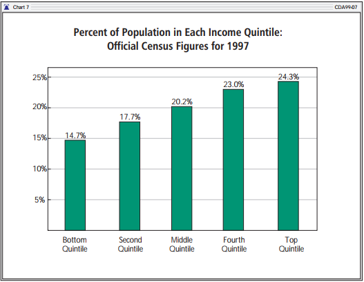
Chart 7 shows the percent of the population contained within each Census "quintile." While the middle quintile does contain roughly one-fifth of the population, the others do not. The high disparity in population between the highest-income and lowest-income quintiles is of particular interest. While the top quintile contains 24.3 percent of the population, the bottom quintile contains only 14.8 percent. In raw numbers, there are 64.2 million persons in the top quintile, compared with 39.2 million in the bottom quintile. Thus, for every person in the lowest quintile, there are 1.64 persons in the top. This imbalance in population is a major factor contributing to the apparent levels of inequality in Census Bureau figures.
The Census Bureau quintiles are unequal in size because they are based on a count of households rather than persons. A household is defined as a person or group of persons living in a single housing unit. In the United States, high-income households tend to be married couples with many members and earners. Low-income households tend to be single persons with little or no earnings. It should be no surprise, then, that the average household in the Census Bureau's top quintile contains 3.1 persons, while the average household in the bottom quintile contains 1.9 people. Overall, 54.9 percent of the households in the bottom quintile have only one person compared with 7 percent in the top quintile.
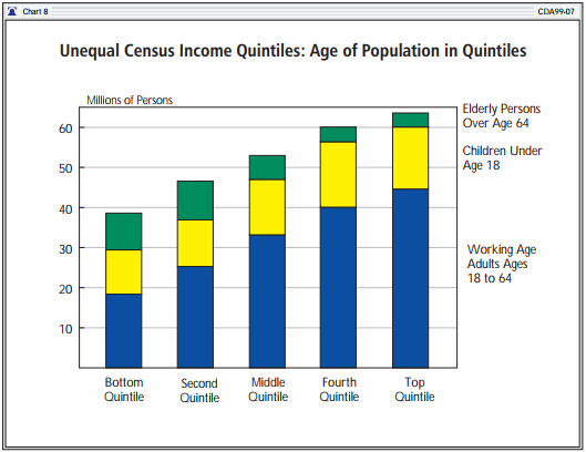
Although the disparity in the population sizes of the Census quintiles is striking, an analysis of the types of individuals in each quintile reveals even greater disparity. Chart 8 shows the number of people in each official quintile divided into age categories: children (under 18), elderly (over age 64), and working age adults (ages 18 to 64). The elderly comprise about one-tenth of the total population. Elderly persons are generally retired and thus tend to have lower incomes than families headed by working adults. It should be no surprise, then, that the lowest three official quintiles contain the bulk of elderly persons. Children, by contrast, are more abundant in the higher-income quintiles. For example, the top two quintiles contain some 34 million children, compared with 24 million in the bottom two quintiles.
However, the greatest differences occur among working age adults. The highest official quintile has 2.4 working age adults for each such adult in the bottom quintile. In fact, the 44.1 million working age adults in the top quintile by themselves outnumber the entire population (adults, elderly, and children combined) of the bottom quintile. The number of working age adults in the top quintile alone is greater than the number of such adults in the lower two quintiles combined.
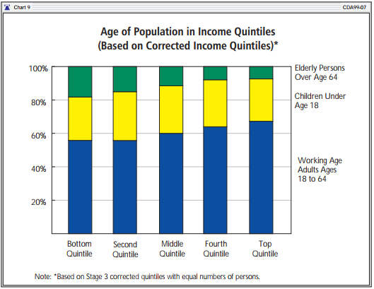
The high-income and low-income quintiles constructed by Census differ radically in population and age as well as family structure, which significantly affects the amount of income in each quintile. The Census practice of measuring inequality by comparing aggregate incomes between "quintiles" that contain widely differing numbers of persons can be extremely misleading. A far clearer picture of income inequality can be obtained by adjusting the quintiles so that each actually contains 20 percent of the population. The large effects of equalizing the number of persons within each quintile (in Stage 3) are shown in Chart 9. Natural differences between the quintiles still exist; the bottom quintile has more elderly persons and fewer working age adults than the other quintiles. But these differences are quite modest compared with those shown in Chart 8.
It appears obvious that the quintiles shown in Chart 9 offer a fairer basis for comparing income equality that the official unbalanced "quintiles" in Chart 8. To a large degree, the relative poverty of the Census Bureau's official bottom quintile shown in Chart 8 results from the simple lack of people within the quintile rather than from economic factors. By contrast, differences in incomes between the quintiles in Chart 9 will be the result mainly of economic factors rather than of mere differences in the size of the quintiles.19
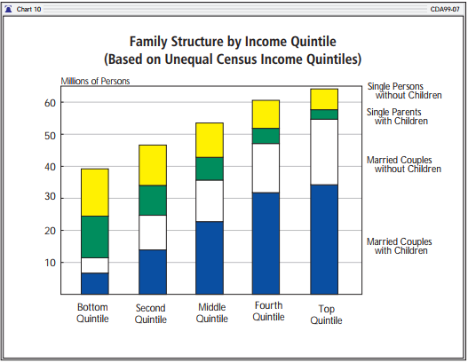
Rich and Poor, Married and Unmarried. One frequently overlooked dimension of the gap between the "rich" and the "poor" is how much it is affected by marital status.20 As Chart 10 shows, only about 30 percent of all persons in Census's bottom quintile live in married couple families; the rest either live in single-parent families or reside alone as single individuals. In the top quintile, the situation is reversed: Some 90 percent of persons live in married couple families. In this case, equalizing the numbers of persons within the quintiles makes little difference; even after each quintile is adjusted to contain the same number of persons, 85 percent of persons in the top quintile continue to live in married couple families compared with one-third in the bottom.
The prevalence of marriage in the higher quintiles and its near absence in the bottom quintile should not be a surprise. Marriage provides the opportunity to bring two incomes into the home. Equally important, married parents tend to have higher levels of ability and skill than do non-married parents. This is particularly true in the case of never-married mothers. Today, one child in three is born out of wedlock to mothers who have, on average, very low levels of math and verbal ability. The collapse of marriage among the less capable members of society has tended to magnify pre-existing tendencies toward inequality. Research by Robert I. Lerman of the Urban Institute has shown that half the increase in income inequality in recent years is a product of the growth of single parenthood.21
DETAILED ANALYSIS:
INEQUALITY OF INCOME AND INEQUALITY OF WORK
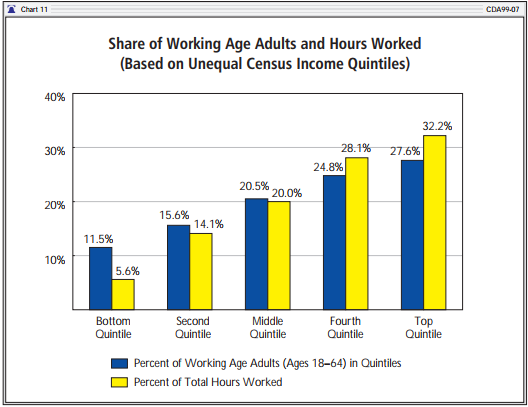
As noted, the official Census Bureau income quintiles contain unequal shares of the population. However, even greater inequality results from the amount of work performed within each quintile. Chart 11 displays the official Census quintiles again. It shows both the percentage of working age adults (ages 18-64) in each quintile and the percentage of total hours of work performed by the quintile. The bottom official quintile contains only 11.5 percent of working age adults and only 5.6 percent of all hours of work performed in the economy in 1997. By contrast, the top quintile contains 27.6 percent of working age adults and nearly one-third of all the hours of labor performed. There are nearly five hours of paid work performed in the Census top quintile for every hour of work performed in the bottom quintile.
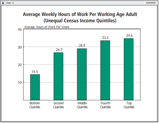
Thus, not only do the lower-income quintiles have fewer working age adults, but each adult on average performs significantly fewer hours of work than his counterparts do in the higher quintiles. Chart 12 shows the average number of hours of work per week per working age adult for each quintile. While there are 14.4 hours of work performance for each working age adult in the bottom quintile, the comparable number in the top quintile is 34.6 hours. On average, non-elderly adults in the Census Bureau's top quintile tend to perform almost three times as much labor as those in the bottom quintile.
Chart 13 shows similar data after the quintiles are adjusted to contain equal numbers of persons (Stage 3). The share of working age adults in the bottom quintile rises dramatically from 11.5 percent to 18.5 percent. The share of work performed in the bottom quintile more than doubles, rising from 5.6 percent to 13.1 percent. These large changes underscore the degree to which apparent inequality is a direct result of the arbitrary population imbalance between Census quintiles.
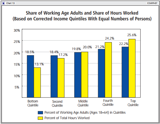
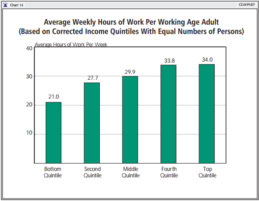
Of course, even after the quintiles are adjusted to contain equal numbers of persons, large differences in the amount of work performed remain. As Chart 13 shows, the amount of hours of work in the top quintile is nearly twice that in the bottom quintile. This is, in part, a result of the fact that the top quintile still contains roughly one-fifth more working age adults than does the bottom quintile, even after the Stage 3 demographic adjustment. Even more important, however, is the continuing difference in the average number of hours worked by adults. After the Stage 3 adjustment, non-elderly adults (ages 18-64) in the top quintile work, on average, 34 hours per week compared with 21 hours in the bottom quintile (see Chart 14).
CONCLUSION
An accurate measurement of income distribution should meet three criteria:
-
It should utilize the most accurate and complete income data available.
- It should treat all persons as having equal value and importance within the system of measurement.
The conventional Census Bureau measurement of income distribution fails on all three tests of accuracy.
Of particular importance is the fact that Census does not treat all persons equally, but "weights" its data to give far greater significance to some persons than it does to others. When decisionmakers, journalists, and the public view Census income distribution figures, most will assume implicitly that the so-called quintiles contain equal shares of the population. After all, the idea that we should measure "inequality" by comparing the total incomes of groups that are themselves substantially unequal in size is, at best, perplexing. But the Census quintiles do not contain equal numbers of persons. The lowest income quintile is significantly underpopulated while the top quintile is overpopulated. This fact dramatically skews the apparent distribution of income, making it appear less equal in the United States than it actually is. Moreover, the critical fact that the quintiles do not contain equal numbers of persons is not revealed in Census reports.
The limitations in the Census measurement of income distribution lead to a considerable exaggeration of income inequality. According to normal Census data, the top quintile of society in 1997 had $13.86 of income for every $1.00 received by the bottom quintile. However, if incomes and taxes are counted more completely, and if the quintiles are adjusted to contain equal numbers of persons, then the ratio of the incomes of the top to the bottom quintile drops to $4.23 to $1.00. Moreover, the remaining difference is due in a large part to the fact that working age adults in the top quintile work almost twice as many hours, on average, as those in the bottom quintile. If such adults worked the same number of hours, the ratio of incomes would fall to around $3.18 to $1.00.
Differences in income in the United States are the natural result of vast differences in ability and behavior between individuals. In general, those persons at high income levels tend to be married, to work large numbers of hours per year, to have high levels of skill and productivity, and to provide higher levels of savings and investment necessary to sustain the overall prosperity of the economy. By contrast, individuals in the lowest income quintile tend generally to be non-married, to work little, and to have lower levels of skill and productivity. Despite these factors, the average per capita income within the bottom quintile remains over $8,000 per year, which is slightly higher, in inflation-adjusted terms, than the average per capita income in the whole society at the beginning of World War II.
Robert E. Rector is Senior Research Fellow at The Heritage Foundation. Rea S. Hederman, Jr. is a Policy Analyst in the Center for Data Analysis at The Heritage Foundation.
Methodological Appendix
This paper examines the distribution of income and income inequality with data extracted from the March Current Population Survey of 1998. Like the Census Bureau, this report studies income at the household level. Group quarters are not included in this survey. The authors also used data extracted from the Internal Revenue Service's Public Use File for 1995 (IRS SOI), containing a sample of actual tax returns designed to replicate the total tax returns received by the IRS. In general, this study does not account for the underreporting of income to the Census Bureau.
Post-Tax Income.
Comprehensive post-tax income includes money income plus realized capital gains, the earned income tax credit, employer-provided health insurance, school lunch benefits, food stamp benefits, government rent subsidies, and Medicaid and Medicare benefits. Federal and state income taxes, payroll taxes, and property taxes are subtracted. Income variables that were only given at the family or person level were aggregated to the household level. Thus, all FICA taxes paid by a household were added together by person and then subtracted from the household's final income. Food stamps and other family-level income data were treated in the same manner.
"Comprehensive post-tax income" is very similar to the Census income "definition 14," as described in the Census Bureau's Current Population Reports, Income, Poverty and Valuation on Noncash Benefits, except that it employs the basic market or insurance value for Medicaid and Medicare without the "fungible" adjustment.22 The insurance value of Medicaid and Medicare (also called the market value) equals the average net government outlay for persons of a specific risk class within a given state. The risk classes used are elderly, disabled persons, non-disabled adult, and non-disabled child. Under this approach, the value of Medicaid or Medicare equals the average cost to the government of medical services provided to a given class of persons; it does not report specific medical expenditures for particular individuals.
The fungible method of valuing Medicare and Medicaid begins with the insurance value of benefits but then alters the values based on the family's income class. The full insurance value is assigned to benefits received by the middle class, but a lower value or zero value is assigned when the same benefits are received by a low-income household. The fungible adjustment was devised for the measurement of poverty, not income distribution. In measuring poverty, it is used to determine whether a household's income should be considered above the poverty threshold. However, the fungible adjustment, which deliberately reduces the value of benefits received by low-income groups, is not appropriate for the measure of income equality that seeks to compare the economic resources of one household relative to others. The fungible adjustment results in a substantial undercounting of government transfers to low-income groups.
Top Coding.
An adjustment was made to compensate for the Census Bureau's "top coding" restriction. Top coding limits the maximum value of capital gains reported in the CPS to $99,999. With normal CPS data, capital gains values that exceed this limit are simply reported as $99,999. In order to obtain a more thorough estimate of high levels of capital gains income, we have replaced those capital gains values subject to the top coding restriction with higher values taken from Internal Revenue Service data. This adjustment was made in the following manner: The 1995 Statistics of Income file of the IRS was used to determine the mean amount of capital gains income for those returns which reported capital gains income above $99,999. This value was adjusted to 1997 dollars and substituted for each of the CPS capital gains values subject to the top code restriction. These adjustments mainly increase reported incomes in the top quintile. There also are some other top coding problems, notably limits on the amounts of earnings and taxes reported. However, no other top coding adjustments were made in this study.
Ranking.
Adjustments to income in Stage 2 were performed at the level of individual households. After each adjustment, the households were re-ranked based on their new income figures. Households then were weighted according to the CPS household weight variable. The Stage 4 adjustments are more general; earnings were adjusted at the quintile level based the aggregate earnings and average labor data within the quintile.
Additional Missing Income.
Although the comprehensive income figures shown in Table 1 are a substantial improvement over conventional Census money income data, they still fall short of real income in the United States economy. This shortfall is due to serious underreporting of incomes in the basic annual Census survey instrument, the Current Population Survey (CPS). Even the most comprehensive measure of pre-tax income from the CPS, which reaches $5.77 trillion (in Stage 2B), still falls short of personal income figures in the Commerce Department's National Income and Product Accounts (NIPA) by some $1.5 trillion.
Clearly, the incorporation of this additional unreported income could skew the measure of income distribution significantly. Correction for this additional underreporting is beyond the scope of the current analysis but will be the subject of future research at The Heritage Foundation. At present, we can only list the types and magnitudes of unreported income and offer tentative suggestions on their impact on income distribution. The largest amount of income unreported in the CPS is some $900 billion in interest, dividends, and rent, which would accrue disproportionately to the higher-income and middle-income quintiles. However, some $300 billion in government transfers and benefits is also unreported; these funds would be concentrated in the lower two quintiles. Some $300 billion in self-employment income is unreported; this shortfall is mainly income in the informal service sector and would accrue largely to the lower half of the population. Finally, there is over $150 million in pension and retirement income that is reported to the IRS but does not appear in the CPS; this would accrue largely to the lower and middle quintiles. Clearly, there is substantial unreported income in both the top and bottom halves of the income distribution. If all this income were reported accurately in the Current Population Survey, it is uncertain whether this would significantly raise or lower the levels of inequality reported in this paper.
Accompanying Tables
For accompanying tables, please click here for the PDF file.
2. Per capita GNP in 1900 was $246. See U.S. Bureau of the Census, Historical Statistics of the United States: Colonial Times to 1970, Part 1 (Washington, D.C.: U.S. Government Printing Office, 1975), Series F1-5, p. 224. Prices adjusted by the Consumer Price Index (CPI-UX1). See Historical Statistics of the United States, Series E 135, pp. 210, 211, and The Economic Report of the President (Washington, D.C.: U.S. Government Printing Office, February 1999), Table B-62, p. 398.
3. Jacob Riis, writing around 1890, described low-skilled workers earning $1.75 for a six-day week. After adjusting for inflation, this comes today to about $31.50 per week, or $5.25 per day; the typical workday would have been at least 12 hours. Minimum wage workers today earn $5.15 per hour, or $41.20 for an eight-hour day. See Jacob A. Riis, How the Other Half Lives (New York: Dover, 1971), p. 184. How the Other Half Lives was first published in 1890.
4. Nicholas Lehman, The Promised Land: The Great Migration and How It Changed America (New York: Alfred A. Knopf, 1991), p. 131.
5. The authors used data from the Current Population Survey, March 1998, Annual Demographic File, CD-ROM version.
6. The Census Bureau does publish income distribution data based on expanded definitions of income in technical tables in some publications; however, these tables, which offer 17 alternative definitions of income, are bewildering even to professionals in the field. In its texts describing inequality, and in the briefing materials given to the media, the Census Bureau continues to promote the conventional figures shown in Stage 1 of this report.
7. For information on adjustments made to compensate for the top coding of capital gains, see the Methodological Appendix.
17. The undercount of income in the CPS results from both the underreporting of the types of income included in the Census definition of money income and the exclusion of other important sources of income from the money income definition. For a more detailed discussion of CPS underreporting, see Robert Rector, Kirk Johnson, and Sarah Youssef, "The Extent of Material Hardship and Poverty in the United States," Review of Social Economy, September 1999.
18. The "Comprehensive Post-Tax Income" figures of Stage 2 are the same as the Census Bureau's income definition 14, except that Census employs a "fungible method" for valuing Medicaid and Medicare. The fungible method begins with the insurance value of benefits and then arbitrarily reduces the value of benefits received by lower-income persons. This technique, which assigns one value to benefits received by the middle class and a reduced value to the same benefits received by lower-income persons, is obviously inappropriate for the measure of income distribution.
19. It can be argued reasonably that larger multi-person households have certain economies of scale that are not available to single-person or smaller households. It is cheaper for two persons to live together than to live separately. Thus, a married couple living together with an income of $40,000 might be said to have a higher standard of living than two individuals living separately with incomes of $20,000 each. However, the economies of scale of larger households do not justify giving the persons living in such households lower weight or importance in measuring income distribution, as is done with the Census quintile allocation. If the goal is not to measure income per se, but rather to measure the consumer utility derived from income, then making allowance for the economies of scale implicit in larger families is reasonable. The best procedure for doing this would be to adjust family income by an economy of scale factor. This can be done, for example, by dividing the family income by the official poverty income thresholds. (The thresholds are themselves adjusted to take account of economies of scale in large households.) Ranking households by the ratio of comprehensive post-tax income to the appropriate poverty threshold for the family produces distribution of income figures that are considerably more equal than the official Census figures but less equal than the data from Stage 3 of our analysis. The ratio of income in the top to bottom quintiles is $7.31 to $1.00. Additional data on this are available upon request from the authors.
20. For a brief review of new research on marriage and income inequality, see "Poor and Single," The Economist, January 16, 1999.


