President John F. Kennedy believed that “a rising tide lifts all boats,” but many question if that remains true today. They point to data showing that productivity has risen sharply since the 1970s while wages have stagnated. They conclude that productivity-driven economic growth does not necessarily benefit American workers.
These claims rest on misinterpreted economic statistics. They juxtapose productivity and pay[1] data that cannot be directly compared, leading to inaccurate conclusions. The claim that pay has lagged far behind productivity growth:
- Examines wage growth instead of total compensation, which includes rapidly growing benefits;
- Uses different price indexes to adjust pay and productivity for inflation;
- Omits the effect of faster depreciation, which reduces net income but not gross productivity; and
- Ignores known measurement errors in Bureau of Labor Statistics (BLS) productivity calculations.
More careful comparisons show that measured productivity has increased 100 percent and average compensation has risen 77 percent over the past 40 years. Issues inflating productivity measurements account for most of the remaining 23 percentage point difference. An apples-to-apples comparison shows that employee compensation continues to closely follow productivity. Workers are earning more as they become more productive.
This fact has important policy implications. Many policymakers mistakenly believe that employees are destined to no longer enjoy the fruits of their labor, even if the economy returns to full employment. They have turned their attention to redistributive economic policies to compensate. Better policies would focus on measures that enable Americans to become more productive and command higher pay—such as reducing the cost of higher education, or reducing regulatory costs that slow the economic recovery and labor compensation.
Workers’ Pay Not Tracking Productivity?
Some analysts argue that employees have not benefitted from productivity growth over the past generation, contending that even as workers have become more productive their pay has stagnated. Left-leaning think tanks like the Economic Policy Institute,[2] columnists like Paul Krugman,[3] and politicians like Senator Elizabeth Warren (D–MA),[4] among others,[5] have all made variations on this argument. The belief underlying many liberal policies is that if employees cannot get ahead through hard work and productivity, government intervention becomes an appealing alternative.
Many academic and policy researchers dispute this conclusion. Harvard Professor Martin Feldstein, the former President of the National Bureau of Economic Research, concluded that the apparent divergence results from using the wrong data to measure pay and productivity.[6] Using the correct data, he finds that pay and productivity have both grown together. Dean Baker, director of the left-leaning Center for Economic and Policy Research, and staff at the Federal Reserve Bank of St. Louis also come to that conclusion.[7] Georgetown Professor Stephen Rose likewise finds that the apparent gap between pay and productivity collapses under scrutiny.[8] He concludes that economic growth resulting from productivity growth continues to benefit working Americans. Most economists believe that employers generally set pay levels according to worker productivity, though a temporary gap may develop during periods of high unemployment such as the nation is now experiencing.
Compensation Rising with Productivity
Economic theory holds that competition among employers forces them to pay workers according to their productivity. In this sense, the market for labor services operates like any other competitive marketplace in the economy. Businesses that pay their workers less than they produce will see their workforce jump to higher-paying competitors, while businesses that pay their workers more than they produce earn inadequate returns, lose money, or even go bankrupt. As a result, workers’ pay should closely track their productivity over time.
Federal economic statistics confirm this prediction: Employee compensation has largely grown in tandem with labor productivity over the past two generations. Productivity rose 100 percent between 1973 and 2012, while hourly employee compensation rose almost as much—77 percent. As discussed below, measurement problems that inflate reported productivity account for most of the remaining difference. Workers have shared in the gains from higher productivity.
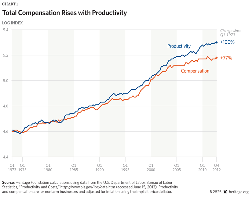
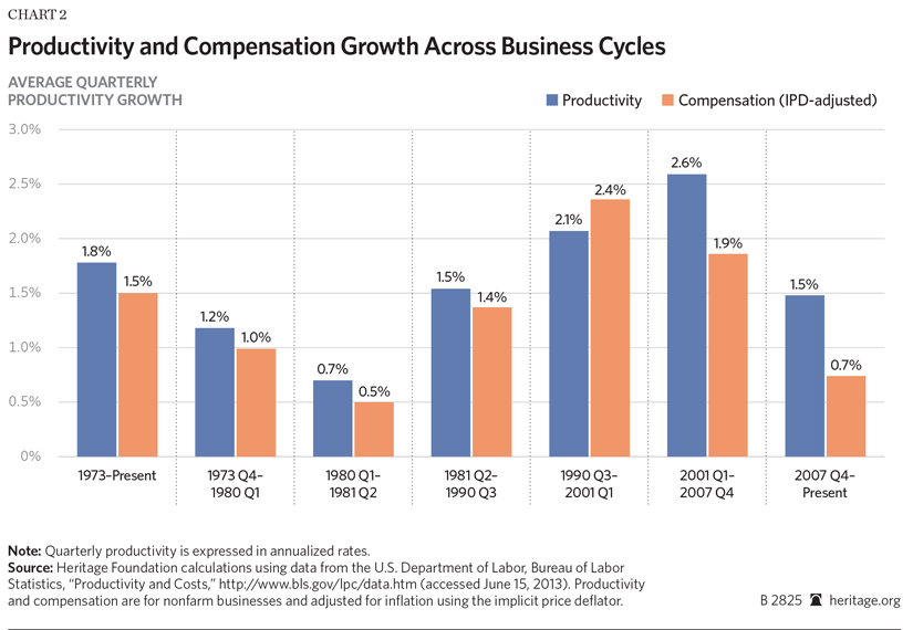
Chart 1 shows compensation and productivity growth over the past 40 years. The y-axis shows a logged index of hourly compensation and productivity, with 1973 as the base year.[9] (In 1973, the trend in productivity growth slowed, and many analysts argue a divergence between pay and productivity began that year.) However, as Chart 2 shows, while productivity has sometimes grown faster than compensation, and vice versa, over time, the two have risen together.
Chart 2 shows average quarterly productivity and compensation growth rates (expressed as annualized rates). Since 1973, productivity has risen at an average annual rate of 1.8 percent. Compensation has grown almost as much, at 1.5 percent. During most business cycles, productivity and compensation growth did not differ by more 0.3 percentage point. Compared properly, productivity and compensation have risen together over the past generation. American workers have earned more as they have become more productive.
Statistical Apples and Oranges
Why then do so many argue that workers’ pay has not risen with their productivity? Senator Warren, for instance, argued that if the federal minimum wage had increased with workers’ productivity since the 1970s, it would now stand at $22.00 an hour, instead of $7.25.[10]
People come to this conclusion by comparing productivity and pay data improperly. Chart 3 shows average real hourly wages and productivity growth. These data appear to support Senator Warren’s point. While productivity has doubled since 1973, average real hourly wages have fallen 7 percent. This differs markedly from Chart 1, which showed pay rising with productivity.
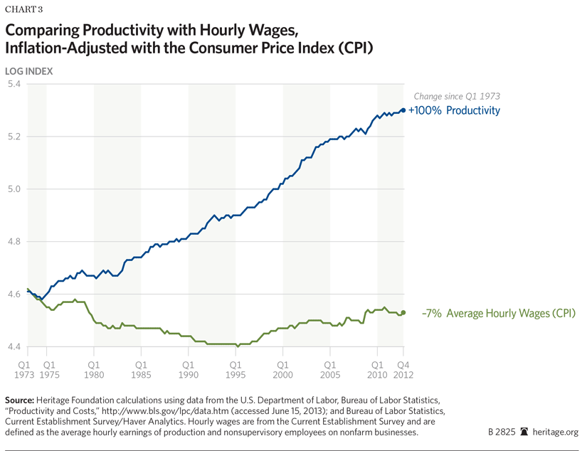
The difference comes from using pay and productivity data collected from different sources and with different methodologies—statistical apples and oranges that cannot be directly compared. The data in Chart 3 includes only wages, not total compensation (which includes benefits), and adjusts wages and productivity for inflation differently. Further, it does not account for factors that artificially boost measured productivity: increases in the rate of depreciation and inaccurate measuring of import prices. Adjusting the data to account for these factors eliminates most of the apparent gap between pay and productivity.
Wages vs. Compensation
Cash wages and salaries make up only part of total employee compensation. Employers also compensate their employees with non-cash benefits, such as health insurance, retirement benefits, and paid leave. These “fringe” benefits have become an increasingly large share of employee earnings, in large part because such benefits are typically tax exempt while wage income is taxable (demonstrating the power of tax policy to affect economic decisions). In 1973, non-wage benefits accounted for 13 percent of employee compensation. By 2012 that figure had risen by half—20 percent of employee earnings now come in benefits.[11]
Economists expect workers’ total compensation to rise with their productivity, but that increase can come in the form of either wages or benefits. Employers care about the total cost of hiring a worker; they do not care about how their labor costs divide between wages and benefits. Employee benefits come out of the wages that employees would otherwise be paid.[12] Examining wage data alone ignores the increasing role of benefits in compensation.[13]
Further, wage data and compensation figures come from different sources and cover different groups of workers. The most commonly used wage figures come from the BLS payroll survey, and include only the pay of “production and non-supervisory” employees, excluding managers and many salaried employees.[14] The figures also exclude bonuses and other irregular cash payments, thus missing many forms of performance-based cash pay.[15] Performance-based pay has become significantly more common since the 1970s, and the payroll survey misses these pay increases.[16]
The BLS separately calculates total compensation as part of its Labor Productivity and Costs (LPC) estimates. These compensation figures cover all workers, including managers and salaried employees. The wage and salary component of total compensation comes from the Quarterly Census of Employment and Wages and includes more cash income than does the payroll survey: bonuses, all commissions, and the value of exercised stock options.[17] Benefits data come from many different sources on employer spending on non-cash compensation.[18]
Different data sources covering different employees and measuring different types of compensation produce different results. It is not clear how much each of these factors contributes to the slower growth of payroll-based wages relative to total compensation.[19] It is clear that analysts should compare productivity to the same total compensation figures produced as part of the productivity calculations. Doing otherwise leads to inaccurate conclusions.[20]
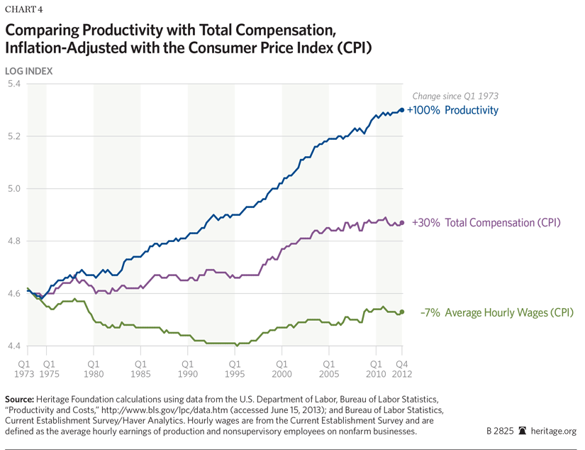
Chart 4 shows the difference that using wages from the payroll survey or total compensation from the LPC series makes. This change shrinks the gap between pay and productivity dramatically. While hourly cash wages measured by the payroll survey have fallen 7 percent since 1973, total compensation as measured by LPC has risen 30 percent. Part of the apparent gap between pay and productivity stems from not including all elements of employee earning and using different data sources.
Adjusting for Inflation. Another large part of the gap comes from how analysts adjust compensation and productivity for inflation. Inflation reduces the value of money over time. Economists use measures of inflation to factor out the effect of rising prices from other quantities of interest like earnings and output. This enables examining inflation-adjusted, or “real,” changes.
The Bureau of Labor Statistics adjusts productivity for inflation using the Implicit Price Deflator (IPD) for nonfarm businesses. Analysts often adjust wages and compensation for inflation using the Consumer Price Index (CPI). These two inflation measures are not directly comparable. They use different methodologies and cover different goods and services. Comparing CPI-adjusted compensation growth to IPD-adjusted productivity growth produces inaccurate conclusions.
The CPI typically estimates higher inflation than many other more modern price indexes do. Consequently, economic figures adjusted for inflation with the CPI attribute more nominal growth to inflation than if they were inflation-adjusted with the IPD. For example, a worker making $10,000 a year in 1973 would—using the CPI—make $52,000 in today’s dollars. Using the IPD to adjust for inflation finds that same worker making $38,000 in today’s dollars. The CPI measures 36 percent greater inflation over the past four decades than the IPD.
Using different measures of inflation will lead to different conclusions. If that same worker’s pay rose from $10,000 in 1973 to $52,000 today, an analyst using the CPI would conclude that his real pay had not increased. An analyst using the IPD would conclude that his real earnings rose by $14,000—from $38,000 to $52,000. Making an apples-to-apples comparison of compensation and productivity requires using the same measure of inflation for both.
Different Methodology. The CPI estimates a higher inflation rate than the IPD for two primary reasons: (1) differences in its methodology and (2) differences in the goods and services it measures. On the calculation side, economists know that consumers respond to shifting prices. As iPods become less expensive, consumers will buy more of them, and fewer of those goods and services for which prices have risen. However, the CPI accounts for this “substitution effect” only infrequently. For this reason most economists believe that the CPI over-estimates inflation.[21]
The CPI also uses less accurate data. In calculating the CPI, the BLS uses data from the Consumer Expenditure Survey (CEX) to estimate how much consumers spend on different types of goods and services. This survey has significant biases. Studies show that households recall large and repeated purchases quite well. Consequently, the CEX measures the amounts that Americans spend on rent and utilities reasonably accurately. However, people often forget smaller and less regular purchases during their interviews. This under-reporting makes it appear that Americans spend far more of their income on housing, gas, or utilities than they actually do.[22] The costs of these goods have increased faster than other goods and services. This “recall bias” increases CPI-measured inflation—and decreases CPI-adjusted compensation.[23]
The implicit price deflator does not suffer from these problems. Neither does another prominent measure of consumer prices, the personal consumption expenditures (PCE) index. The government calculates both these measures using sales data from businesses. Businesses keep very detailed records on their sales, so these indexes suffer from little recall bias. The IPD and PCE calculations also regularly account for changing consumer behavior in response to price changes.
These technical differences in methodology do not reflect substantive differences in underlying inflation rates, although they do make the CPI less accurate than the IPD and PCE. If the Bureau of Economic Analysis used the CPI methodology to adjust for inflation, its productivity estimates would also grow more slowly. Methodological differences make real productivity appear to grow more rapidly than real compensation.
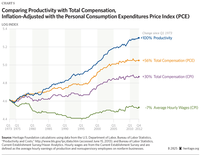
Chart 5 shows the large impact that these methodological differences make. It shows real compensation, inflation-adjusted using both the CPI and the PCE index. The Bureau of Economic Analysis calculates the PCE index using a formula that accounts for consumer substitution, and uses surveys that are less susceptible to recall bias.[24] Simply changing from the CPI to the PCE dramatically increases compensation growth. While CPI-adjusted real compensation grew 30 percent over the past four decades, PCE-adjusted real compensation grew almost twice as much—56 percent. Much of the apparent divergence between pay and productivity stems from using different surveys and formulas to calculate inflation.
Goods Consumed vs. Goods Produced. Another difference between the inflation measures has nothing to do with their underlying technical methodology. The CPI and PCE both measure changes in the prices of consumer goods. The IPD measures the change in prices of goods and services produced by nonfarm businesses. Here, the IPD differs from the CPI and PCE. The IPD includes goods and services that businesses sell to other businesses or export to other countries, as well as those sold to consumers. The CPI and PCE do not; they do include imported consumer goods such as oil.[25]
Over the past generation, the goods and services that consumers buy have risen in price faster than the goods and services businesses produce (including those sold to other companies or overseas). Consequently, price indexes that measure consumer goods—like the CPI and PCE—report greater rates of inflation than the IPD. Nonetheless, determining whether workers’ pay has risen with their productivity requires using the IPD.
Economic theory predicts that employers pay workers according to the value of their marginal product—the benefit to the firm of hiring them. Marginal productivity depends on the price at which a business sells its goods, not the price of other consumer goods. Economists would expect a U.S. company to pay more if higher demand raised the price of its goods or services. Economists would not expect the company to increase compensation because, for instance, oil imports became more expensive. To discern whether compensation has kept pace with worker productivity, economists use the prices of the goods or services that employees produce.[26]
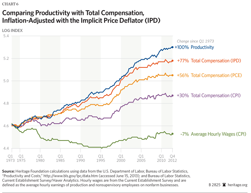
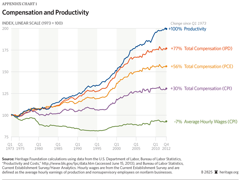
Doing so further shrinks the gap between compensation and productivity. Chart 6 shows productivity and compensation growth adjusted for inflation using the IPD. Measuring compensation and productivity with the same gauge of inflation shows that compensation has grown 77 percent while productivity increased by 100 percent.
Depreciation. Almost four-fifths of the apparent gap between productivity and compensation comes from apples-to-oranges comparisons that understate compensation growth. Most of the remaining gap comes from overestimating productivity growth.
Part of this overestimation occurs because the amount of depreciation in the nation’s stock of productive capital has increased.[27] Productivity measures gross output: everything that employees produce. However, to preserve the stock of productive capital, employers must replace capital equipment as it wears out or becomes obsolete. Resources spent replacing depreciated equipment do not increase income.[28] As the economist Dean Baker put it, “[N]o one can eat depreciation.”[29]
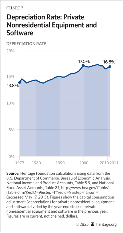
As long as the rate of depreciation remains constant, it does not affect compensation growth rates. However, the rate at which investment depreciates has increased over the past generation. In the early 1970s, private nonresidential equipment and software depreciated at an annual rate of approximately 14 percent. By the early 2000s that rate had risen by one-fifth to around 17 percent.[30]
Among other economic changes, businesses use more computers and software in production—short-lived investments that need replacement within a few years. Employers can still use a factory built in 1993. Virtually no one still uses 1993-era computers. Consequently employers need to spend more of their revenues replacing obsolete equipment. They cannot use that money to compensate their employees.
Faster depreciation reduces potential business—and employee—income without reducing measured productivity. The Bureau of Labor Statistics does not account for depreciation in its productivity calculations. It measures gross productivity, not net productivity. However, the effect of depreciation appears in the national economic accounts.
The Bureau of Economic Analysis measures gross domestic product (GDP) as well as net domestic product (NDP). GDP measures everything produced in the economy in a given year. NDP subtracts depreciation from GDP. NDP measures useable output, factoring out resources spent replacing depreciated capital. The difference between NDP and GDP growth rates shows the effect of faster depreciation. It also reveals the approximate size of the bias in productivity figures that come from ignoring depreciation. Compensation should rise in line with the growth of net output, not gross output.
Depending on how economists adjust for inflation, faster depreciation accounts for between one-quarter and one-half of the remaining gap between productivity and compensation. Real GDP per hour worked increased by 69 percent over the past 40 years. Real NDP per hour worked rose only 58 percent—11 percentage points less.[31] Neither employees nor employers consume this difference. On this basis, changes in depreciation account for approximately half of the remaining 23 percentage point gap between productivity and compensation.[32]
Changes in the relative prices of investment goods and consumption goods complicate this analysis further.[33] Private investment spending has changed little as a share of the economy over the past generation.[34] However, investment goods—such as equipment and software—have risen in price more slowly than consumption goods.[35] As a result, inflation adjustments make past investment and depreciation look like a smaller share of the economy than more recent investment and depreciation.[36] This is distinct from the increase in the rate at which equipment wears out or becomes obsolete. Faster apparent depreciation slows real NDP growth relative to GDP.
One way that some adjust for this is to use the same price index to calculate real NDP and real GDP.[37] This kind of adjustment effectively ignores the fact that NDP and GDP contain different amounts of consumption and investment goods. Using the IPD for GDP to adjust both NDP and GDP finds real GDP growing by 69 percent since 1973, while real NDP has grown 64 percent.[38] That accounts for roughly one-quarter of the remaining difference between productivity and compensation.
Depreciation has risen, reducing the net output available in the economy, and thus reducing the income available to remunerate workers. The extent of this effect depends on how analysts adjust for inflation. Nonetheless, faster depreciation accounts for a significant portion of the remaining gap between compensation and productivity.
Problems with Measuring Productivity
Measurement problems also artificially inflate productivity statistics. Recent economic studies have found that the Bureau of Labor Statistics systematically overestimates the prices that American businesses pay for imported goods they use in production.[39] This happens for two reasons. First, the BLS misses many of the price reductions that occur when foreign producers replace one product line with a new and less expensive one.[40] Economists call this “product replacement bias.” Second, the BLS does not capture cost reductions that occur when businesses replace domestic inputs in production with less-expensive imported goods.[41] Economists call this occurrence “offshoring bias.” Consequently, imported goods used in production appear more expensive than they actually are.
This seemingly small error has large implications. Artificially high prices make it look as if businesses buy fewer foreign goods and services than they actually do. Businesses appear to produce more output with fewer inputs—also known as higher productivity. These productivity gains are statistical illusions. The government mistakenly reported cost reductions from lower international prices as more efficient domestic production.
This bias accounts for 7 percent to 18 percent of manufacturing productivity growth between 1997 and 2007.[42] It undoubtedly affects other sectors, such as retail, as well, though economists have not estimated the bias in non-manufacturing sectors. However, productivity has grown faster in manufacturing than in the overall economy.[43] Reducing estimated manufacturing productivity will reduce national productivity estimates more than similar reductions in other sectors would.
Depending on how much this measurement problem affects other sectors, it could account for most of the remaining difference between productivity and compensation growth. Statistical illusions raise no one’s pay. Productivity has not grown quite as fast as the official numbers suggest.
Recent Divergence Overstated. Inaccurately measured import prices may explain part of the recent divergence between pay and productivity estimates. Chart 2 shows measured productivity and compensation growth rates across business cycles—in most cycles the two closely tracked—differing by no more than 0.3 percentage point a year. Since 2001, the two have diverged, with productivity exceeding compensation growth by over 0.7 percentage point a year. Between 2001 and 2007, productivity also grew 2.6 percent annually—the fastest of any business cycle in the past four decades.
This coincides with a substantial expansion of international trade. Throughout the 1980s and early 1990s, imports averaged about 10 percent of GDP.[44] They expanded after Congress passed the North American Free Trade Agreement (NAFTA) in 1993; by 2001, imports averaged 13.6 percent of GDP. Bracketing a large drop during the recession, trade continued to expand since 2001. Today America imports goods and services worth 17.5 percent of GDP.[45] This has also affected domestic production. U.S. manufacturers imported 17 percent of the materials they used in 1997, by 2007 that figure had risen by half, to 25 percent.[46]
More imports increase the problems caused by inaccurately measuring import prices. Cost reductions from using imported goods, falsely attributed to increased productivity, have increased since the late 1990s. Until the BLS corrects its import price measures it is not possible to quantify exactly how much of the economy-wide productivity gains did not actually occur. Nonetheless it remains clear that the official figures overstate productivity growth, and this problem has worsened since 2001.
Breaking Down the Difference. Separate measures of inflation, the difference between hourly wages and total compensation, and factors inflating productivity measurements account for most of the gap between pay and productivity. Most of the apparent gap between pay and productivity since 1973 is a statistical illusion. Growth in compensation closely tracks the growth in the value of what employees produce.
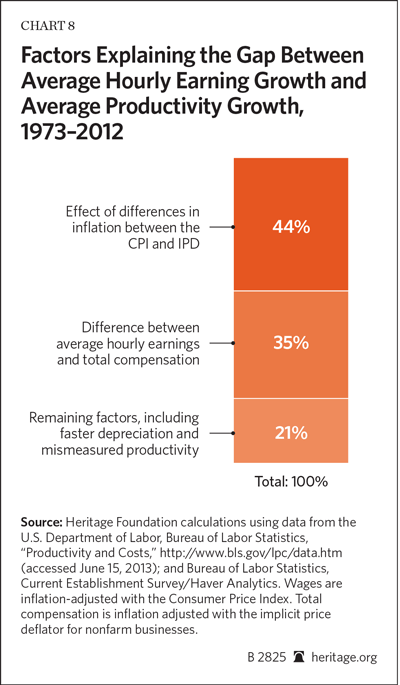
Chart 8 breaks down factors causing the apparent difference; 35 percent of the difference comes from looking at average hourly earnings of a subset of the workforce instead of total compensation paid to all employees.[47] Forty-four percent comes from using different measures of inflation to adjust compensation and productivity; 21 percent is caused by remaining factors—including depreciation, inaccurately measured import prices, and any actual difference between the two measures. Proper comparisons show average compensation growth largely tracks average productivity growth.
Mean vs. Median Compensation. The fact that average productivity has risen with average compensation does not mean that employees face no economic challenges. Median compensation growth has not risen as quickly as average productivity—but this is not because employers have deprived workers of the fruits of their labor. Rather, in developed countries across the world high-skilled workers’ productivity has grown faster than that of less-skilled workers. Most economists attribute this phenomenon to “skill-biased technological change.”[48]
Modern information technology allows skilled workers to do far more than they could with just a pen and paper. Researchers do not have to physically retrieve data; they can download terabytes of information almost instantaneously online. Architects can use computer simulations to rapidly overhaul their designs. A few engineers can operate robots that run mass-assembly lines. Across the globe, technology has made high-skilled workers even more productive.
Workers with fewer skills have benefited far less from technological advances. Employment—especially of less-skilled workers—has shifted toward the service sector.[49] Service-sector jobs are typically more labor intensive and have experienced slower productivity growth than jobs in the goods-producing sector. It takes as many people today as in the 1970s to feed residents in a nursing home, clean a building, or wait tables in a restaurant. Median productivity has risen less than average productivity.
The “Baumol effect” drives compensation increases in jobs with low productivity growth—competition for workers forces employers with lower productivity growth to match the pay offered in jobs with higher productivity growth.[50] However, the Baumol effect only raises wages when workers have (or can gain) the ability to switch between jobs.[51] Jobs relying on physical abilities typically require different skills than jobs that require more abstract technical abilities. Consequently, skill-biased technological changes have not increased pay as much in jobs that rely on physical skills as in jobs requiring technical skills.
Many analysts have produced studies pointing out the gap between median compensation growth and average productivity. They are correct, but draw the wrong conclusions. The economy does not face a large “divergence between pay and productivity.”[52] Rather, productivity has not risen as fast among some groups of workers. Policymakers should not try to reconnect pay and productivity; they diverge only slightly. Rather, they should look for ways to make less-skilled workers more productive, such as reducing the cost of higher education. Market forces will then force employers to increase compensation.
Conclusion
Many pundits and politicians contend that employees’ pay has not kept up with their productivity and that this phenomenon pre-dates the recent deep recession and sluggish recovery. They argue that workers are more productive than ever before, but that employers systematically underpay them. Fortunately, these claims are false. They rest on mistaken comparisons of economic data. Looking at total compensation data—including benefits—from the same source as the productivity figures and using consistent measures of inflation eliminate over three-quarters of the apparent gap between pay and productivity. Factors artificially inflating productivity—like greater depreciation and measurement errors—account for most of the remaining difference. Workers’ compensation has closely tracked their productivity over the past generation. Policymakers should not worry about closing this nonexistent gap. Instead they should look for ways to improve the skills of less-productive workers.
—James Sherk is Senior Policy Analyst in Labor Economics in the Center for Data Analysis at The Heritage Foundation.
Appendix A: Productivity and Compensation Graphed Linearly
The charts presented in this paper graphed the log of productivity and compensation growth. This illustrates the relative magnitude of changes consistently over time. Appendix Chart 1 reproduces the paper’s Chart 6 in linear form to illustrate the absolute magnitude of changes during this time period.
Appendix B: Price Indices Measuring Inflation
Consumer Price Index
The Bureau of Labor Statistics (BLS) calculates the Consumer Price Index (CPI) to measure the inflation that consumers experience in their daily life. It uses a Laspeyres methodology, that is, the BLS fixes the composition of a basket of goods that the average consumer purchases in a base year and measures how the prices of the goods in that basket change over time. This methodology fails to account for changes in consumers’ consumption patterns as prices shift, also known as “substitution bias.” For example, as iPods became less expensive, consumers purchased more of them. iPods would thus come to take up a larger share of the average consumer’s basket of goods, but the Laspeyres methodology ignores this effect.
The formula for computing a Laspeyres price index is:
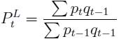
where, pt and qt represent the prices and quantities in year t, respectively.
Personal Consumption Expenditures and Implicit Price Deflator Indexes
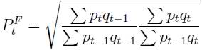
To overcome this problem, the Bureau of Economic Analysis uses a Fisher chain formula to calculate the Personal Consumption Expenditures (PCE) price index and the implicit price deflator (IPD) for nonfarm businesses.[53] A Fisher chain formula takes the geometric mean of the Paasche and Laspeyres price calculations. The Paasche formula is a mirror image of the Laspeyres formula. A Laspeyres index fixes the basket of goods in a base year. A Paasche index fixes the basket of goods in the current year and compares the price in the present year to that of earlier years. By taking the geometric average of these formulas, these indexes capture the change in consumers’ consumption patterns between years.
The formula for a Paasche price index is:
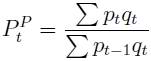
where pt and qt represent the prices and quantities in year t, respectively. The Fisher chain price index is calculated by taking the geometric mean of the Laspeyres price index and the Paasche price index:
or
![]()
For more details, see Bureau of Economic Analysis,
“Concepts and Methods of the U.S. National Income and Product Accounts,” Chapter 4, October 2009, http://www.bea.gov/national/pdf/NIPAhandbookch1-4.pdf (accessed June 26, 2013).