Increasing living standards depends on increasing worker productivity. Competition causes firms to tie wages closely to employees’ productivity. Since 1973, the average private-sector employee’s productivity has increased by 81 percent, while their average compensation has increased by 78 percent.
Some analysts have produced charts purporting to show that productivity has grown sharply while pay has remained nearly flat. These charts contain many methodological errors. They:
- Compare the pay of only some workers to the productivity of all employees;
- Count productivity growth of the self-employed, but exclude their pay growth; and
- Measure inflation differently to calculate pay growth and productivity growth.
Correcting these errors eliminates the apparent gap between productivity and compensation growth. Policies that try to boost compensation directly (such as minimum-wage increases) calcify the job market and increase unemployment. To help workers get ahead, policymakers should pursue policies that help them become more productive and reduce regulatory barriers preventing them from using their existing skills in the most productive way.
Higher Productivity Leads to Higher Incomes
Raising workers’ compensation requires increasing productivity. Employees’ compensation closely tracks the value of the goods and services they produce.[1] Firms that pay workers more than the value that they add go out of business. Conversely, firms that pay their employees less than the value they create see competitors poach their employees away. This dynamic explains why more than 95 percent of Americans earn more than the minimum wage, despite companies having no legal obligation to pay more. Competition causes employers to pay workers according to their productivity.[2]
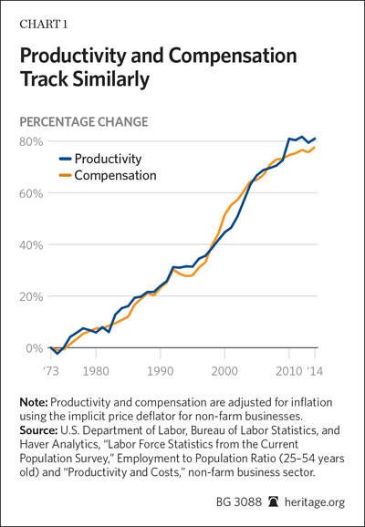
Chart 1 shows this cause and effect directly. It displays the growth of average employee productivity and compensation in the non-farm business sector.[3] Since 1973, hourly productivity has increased by 81 percent, net of depreciation. Average employee compensation has increased 78 percent.
A similar relationship holds true at the sectoral level. Workers in industries that have experienced faster productivity growth have also enjoyed faster compensation growth. For example, average hourly productivity increased by 150 percent in the oil and gas extraction sector between 1987 and 2013. During that period, average hourly compensation in that sector increased by 126 percent. Similarly, productivity in grocery stores grew by just 16 percent during those years. In that period, the average real compensation of grocery store employees grew by 19 percent.[4]
Higher productivity holds the key to raising incomes. As Federal Reserve Chairwoman Janet Yellen has explained, “The most important factor determining continued advances in living standards is productivity growth.”[5] To increase workers’ pay, policymakers need to find ways to increase their productivity.
False Claims that Pay and Productivity Diverge
Many prominent public figures argue that pay and productivity have diverged sharply. President Barack Obama has stated that “since 1979, when I graduated from high school, our productivity is up by more than 90 percent, but the income of the typical family has increased by less than 8 percent.”[6] Labor Secretary Tom Perez argues for new overtime regulations on the basis that businesses allegedly no longer pay workers according to their productivity.[7]
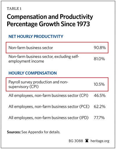
These claims derive almost exclusively from reports produced by the Economic Policy Institute (EPI).[8] EPI is a union-backed think tank with a board of directors chaired by AFL–CIO President Richard Trumka.[9] EPI’s reports juxtapose a measure of payroll-survey-based employee compensation with net productivity growth since 1948. EPI shows pay growth closely tracking productivity growth until the early 1970s; then pay growth stalls while productivity continues to increase.
The highlighted rows in Table 1 and the top and bottom lines of Chart 3 replicate EPI’s methodology for the non-farm business sector. (EPI’s reports typically include the government and nonprofit sectors, for which productivity is conceptually difficult to measure.)[10] EPI’s approach shows productivity growing 91 percent since 1973, while employee compensation has only grown 10 percent.[11]
Little Academic Support
Academic economists largely reject this analysis and the conclusion that salary no longer grows with productivity. Harvard professor Martin Feldstein, the former president of the National Bureau of Economic Research, concluded that the apparent divergence results from comparing the wrong data.[12] Using the correct data, he finds that pay and productivity have both grown together. Staff at the Federal Reserve Bank of St. Louis found the same result.[13]
Even prominent liberal economists who have examined this question agree. Dean Baker, director of the Center for Economic and Policy Research, finds that pay growth tracks productivity growth when comparing the same groups of workers and using the same measure of inflation.[14] Harvard professor Robert Lawrence served on President Bill Clinton’s Council of Economic Advisers; he comes to the same conclusion.[15] George Washington University professor Stephen Rose—a former Clinton Administration Labor Department official currently affiliated with the Urban Institute—likewise finds that the apparent gap between pay and productivity collapses under scrutiny.[16] He concludes that productivity growth continues to benefit working Americans.
Most economists who examine the issue conclude that firms pay workers according to the value they produce.
Productivity and Pay for Different Workers
A major reason why some studies show a gap between pay and productivity is that they compare different groups of employees and ignore a portion of employees’ compensation. These studies measure the productivity of all employees as well as the self-employed. However, they only consider the compensation of some employees: private-sector “production and non-supervisory employees” covered by the Bureau of Labor Statistics (BLS) payroll survey.[17]
BLS data show that production and non-supervisory jobs constitute about 63 percent of jobs in the overall economy.[18] This category excludes all government employees, the self-employed, and about 20 percent of private-sector firms’ employees. Among the excluded are the majority of the most highly paid workers in America. This makes a large difference: Over the past generation, compensation has risen faster among high earners than in the rest of the economy.
Excludes Performance Pay. The payroll survey also excludes most performance-based compensation, such as commissions, bonuses, and stock options.[19] Performance-based pay has become widespread throughout the economy since the 1970s.[20] It has particularly grown among top earners. Many senior corporate employees receive much of their total compensation in stock options. If the company does well, these stock options become valuable; if it does poorly, they become worthless. For example, Apple paid its former CEO Steve Jobs a salary of $1 a year. Jobs became a billionaire because his stock options became very valuable as Apple’s stock rose under his leadership. The payroll survey excludes such performance-based compensation.[21] Excluding top earners and most performance pay makes average compensation appear to have grown more slowly than it actually did.
Analyzing the pay and productivity of different groups of workers while ignoring performance-based pay distorts comparisons of compensation and productivity.
Payroll Survey More Limited than Recognized
Beyond these problems, the payroll survey does a poor job of measuring the wages of production and non-supervisory employees. BLS researchers have found that the payroll survey shows much slower wage growth for these “typical” employees than the household survey finds.[22]
Most firms do not classify their employees as “production and non-supervisory” employees. So when the BLS surveys them, it often improperly excludes workers whose wages it should report. It appears that employers exclude the pay of most of their salaried workforce.[23] As economists at the BLS, the Bank of Canada, and Drexel University examining this question recently concluded, the “segment of workers for which establishments have traditionally reported earnings in the CES [Current Employment Statistics] is not representative of average earnings in the non-farm business sector.”[24] (The CES is the formal name for the payroll survey).
There is no reason to expect a problematic measure of pay for primarily hourly workers to grow in tandem with the productivity of all employees across the economy. Economic theory does not predict that the pay of one group of workers should necessarily match the productivity of another group of employees. This particularly holds given the faster growth in both performance-based pay and top earnings since the 1970s. Companies expressly use performance-based pay to tie their employees’ pay to their productivity. Theoretically, total productivity growth should track the total compensation—including performance pay—of all workers in the economy.
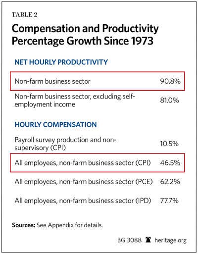
The shaded rows in Table 2 show how examining all workers and including performance-based pay changes the picture. The table uses total employee compensation data from the National Income and Product Accounts (NIPA). This change increases compensation growth from 10 percent to 47 percent between 1973 and 2014. About two-fifths of this difference comes from including irregular performance-based payments (such as bonuses and stock options), while just under three-fifths comes from examining the entire workforce instead of primarily hourly employees.[25]
The Self-Employed
The studies showing a large pay/productivity gap have another significant problem: They include the productivity of the self-employed, but they exclude their compensation. Many Americans work for themselves through a sole proprietorship. Their self-employment income takes many forms and is difficult to classify as either employment income or business profit.
Some sole proprietors are business owners, though they often put much of their own labor into their enterprises (such as a restaurant or corner market owner). Other sole proprietors work in regular jobs; they simply work independently instead of for a firm (a self-employed plumber or construction contractor, for instance). Still others fall somewhere in between (say, a trucker who buys his own rig and drives routes he chooses).
The government also classifies the income from many “new economy” jobs as self-employment income. For example, Uber partners with drivers to provide on-demand taxi-like services. Airbnb allows people to rent out their residences. Etsy and eBay allow artisans and artists to sell homemade goods to customers worldwide. The Bureau of Economic Analysis classifies these earnings as proprietors’ income.[26]
Overall, self-employment production and income has grown as a share of the economy since the 1970s.[27] Chart 2 shows this increase visually.
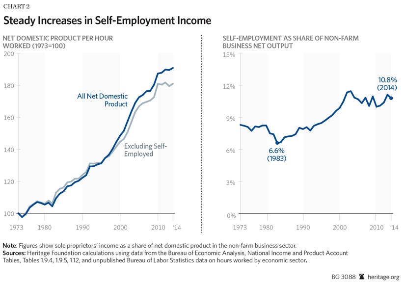
Chart 2 shows that including self-employment activities increases productivity growth by over 10 percentage points between 1973 and 2014. Chart 2 also shows the proportion of net output in the nonfarm business sector accounted for by self-employment income; it has increased by almost a third since 1973.[28]
The studies showing a pay and productivity gap include this growth in the productivity of the self-employed. However, they ignore it when measuring employee pay. The payroll survey does not cover people who work for themselves. Similarly, the self-employed report their earnings to the IRS differently than firms do for their employees. Consequently, both the BLS payroll survey and the NIPA employee compensation figures exclude self-employment earnings.
Counting self-employment activities toward productivity but not compensation has little economic justification. Analysts should either include or exclude self-employment activities from both measurements. In this context, excluding them makes the most sense. By definition, the self-employed pay themselves everything they produce. Including them sheds no light on the question of whether firms pay their employees commensurate with their productivity.

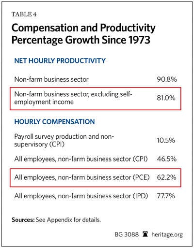
The highlighted row in the top panel of Table 3 shows the growth of net productivity, excluding self-employment income. This exclusion reduces productivity growth between 1973 and 2014 from 91 percent to 81 percent, closing about a quarter of the remaining apparent gap between pay and productivity.
Consistent Measures of Inflation
Almost all of the remaining difference in pay and productivity comes from measuring pay and productivity with different inflation indices. Proponents of the pay gap theory measure inflation in workers’ compensation using the Consumer Price Index Research Series (CPI)[29] while measuring inflation in workers’ productivity using the implicit price deflator (IPD).[30] These two inflation measures are not directly comparable. They use different methodologies, different data, and cover different goods and services. Between 1973 and 2014, the CPI reported 21 percent more price inflation than the IPD.
As a result, using different price indices creates an artificial gap between inflation-adjusted pay and productivity. For example, consider a self-employed plumber who produces and thus earns $50,000 in today’s dollars. Adjusting pay for inflation with the CPI shows that plumber earns $10,500 in 1973 dollars. But adjusting his productivity for inflation using the IPD shows that he produces $12,700 in 1973 dollars—a fifth more than he earns. Using different measures of inflation makes it look like the plumber produces far more than he pays himself, despite being self-employed.
This apparent gap between pay and productivity does not exist in the real world; it is purely an artifact of adjusting pay and productivity for inflation differently. Making an apples-to-apples comparison of compensation and productivity requires using the same measure of inflation for both.
Three primary differences cause the CPI to report higher inflation than the IPD: (1) the CPI fails to regularly account for changing shopping patterns; (2) the CPI uses different data to weight spending; and (3) the CPI measures different goods and services.
Changing Consumption Patterns. Economists know that consumers respond to shifting prices. As smartphones have become less expensive, consumers have bought more of them, and fewer of those goods and services for which prices have risen. However, the CPI accounts for this “substitution effect” only infrequently. For this reason, most economists believe that the CPI over-estimates inflation.[31] The IPD uses a “chained” methodology that regularly takes account of changing spending patterns.
Less-Accurate Data. The IPD also uses more accurate data than the CPI. In calculating the CPI, the BLS uses data from the Consumer Expenditure Survey (CEX) to estimate how much consumers spend on different types of goods and services. This survey has significant biases. Studies show that households recall large and repeated purchases quite well. Consequently, the CEX measures the amounts that Americans spend on rent and utilities reasonably accurately. However, people often forget smaller and less regular purchases during their interviews. This underreporting makes it appear that Americans spend far more of their income on housing, gas, or utilities than they actually do.[32] The costs of these goods have increased faster than other goods and services. This “recall bias” increases CPI-measured inflation—and decreases CPI-adjusted compensation.[33]
By contrast, the government calculates the IPD using business sales data. Businesses keep detailed records on their sales, so the IPD suffers from little recall bias. As a result, it shows lower inflation growth.
These technical differences in methodology do not reflect substantive differences in underlying inflation rates, although they do make the CPI less accurate than the IPD. If the Bureau of Economic Analysis used the CPI methodology to adjust for inflation, its productivity estimates would also grow more slowly.
Using the Same Methodology Matters. These first two methodological differences account for much of the remaining apparent gap between productivity and pay. The government produces another consumer price index using the more modern IPD methodology. Both the Federal Reserve and Congressional Budget Office consider this alternative index—the Personal Consumption Expenditures (PCE) index—a more accurate measure of consumer inflation than the CPI.[34]
The highlighted row in the bottom panel of Table 4 shows total compensation growth, adjusting compensation for inflation with the PCE instead of the CPI. Using the PCE eliminates the differences in inflation rates caused by (1) not accounting for changing consumption patterns, and (2) using less accurate data on consumer spending.
Measuring compensation inflation with the PCE increases average compensation growth from 47 percent to 62 percent. Much of the apparent divergence between compensation and productivity thus does not exist in any meaningful sense in the real world. It is a statistical artifact created by measuring inflation differently for productivity than for compensation.
Different Goods and Services. Finally, the IPD, PCE, and CPI also measure different goods and services. The CPI and PCE measure changes in prices of consumption: the goods and services Americans buy. The IPD measures the change in prices of goods and services that Americans produce. These can differ. Americans produce many goods and services that they then sell overseas. Conversely Americans consume many products produced by other countries (such as oil). Prices of consumption and production goods could well diverge if the “terms of trade” have shifted.
In fact, this price divergence has not occurred across the overall economy. Over the past generation, production prices and consumption prices have moved almost in tandem. Since 1973, the PCE has grown at almost exactly the same pace as the IPD for net domestic product. Virtually no gap exists in price growth for production and consumption goods across the overall economy—if analysts examine them with the same methodology.
A gap between the PCE and IPD does exist in the portion of the economy covered by the nonfarm business sector. Measured prices have risen much more quickly in non-profits, the government, and owner-occupied housing than in the rest of the economy. Consequently, the IPD for the non-farm business sector—which excludes those sectors—has risen more slowly than economy-wide price indices for consumption or production.
Using the Same Measure
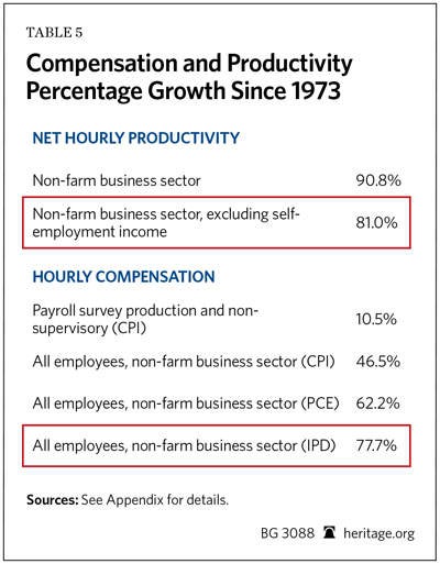
The highlighted rows of both panels in Table 5 show productivity and average compensation in the non-farm business sector, both adjusted using the IPD. This change almost entirely eliminates the remaining gap between pay and productivity. Average compensation growth rises from 62 percent to 78 percent—very close to the 81 percent growth in productivity since 1973.
Whether measuring inflation with the IPD makes sense depends on the question that analysts want to answer. Researchers interested in how living standards have grown should measure compensation growth with a consumption price index—preferably the more accurate PCE. Consumption prices ultimately matter for consumer welfare.
However, researchers asking whether compensation has grown in line with productivity should measure both with the same production price index.[35] Theoretically, worker compensation should track production prices. The resources that businesses have with which to pay workers come from the sales of the goods they produce. Changes in the “terms of trade” with foreign nations may affect welfare, but they do not affect workers’ productivity from their employers’ point of view.
For example, changes in international oil prices make American consumers better or worse off. But they do not affect the productivity of workers outside the energy sector. Analysts would not expect hospitals to change nurses’ pay because oil prices shifted.
Moreover, the math underlying chained price indices means that figures estimated using different indices are generally not comparable. Using one price index to measure pay and another to measure productivity produces statistical anomalies.[36] It creates apparent differences that have no meaning in the real world. (See Section 4 of Appendix A for more details on this problem.)
Consider again the self-employed plumber. By definition his pay equals his productivity. If analysts measured inflation in his pay with a consumption price index, and in his productivity with the non-farm business IPD, the difference in inflation rates would make it appear that his productivity growth outstripped his pay. Yet every year the plumber would “pay himself” everything he earned. The apparent gap between his productivity and pay never appears in his actual bank account. Using the same inflation measure avoids these statistical anomalies. Using the same measure of inflation and comparing pay productivity for the same group of workers shows businesses compensate workers for the value they create.
Breaking Down the Difference
Chart 3 illustrates the effect of these different methodological choices. The yellow and green lines show total employee compensation and net productivity (excluding self-employment earnings), respectively, in the non-farm business sector. They replicate the data shown in Chart 1, and show that productivity and pay growth have closely tracked each other since 1973.
The top and bottom lines show the data that believers in a pay-productivity gap usually display: growth in hourly net productivity (including the self-employed) and the growth in payroll-survey-based compensation for production workers (inflation-adjusted with the CPI). These charts show pay and productivity diverging considerably.
The difference between these series illustrates the effects of the different methodological choices. The difference between the top two lines in Chart 3 shows the effect of including the productivity growth of the self-employed. The difference between total compensation adjusted with the IPD and the PCE shows the effect of using output and consumption price indices separately. The difference between total compensation adjusted with the PCE and the CPI shows the effect of using different formulas and weights to measure consumer price inflation. The gap between CPI-adjusted all-employee compensation and payroll-survey-based compensation shows the difference looking at all employees instead of just some of them.
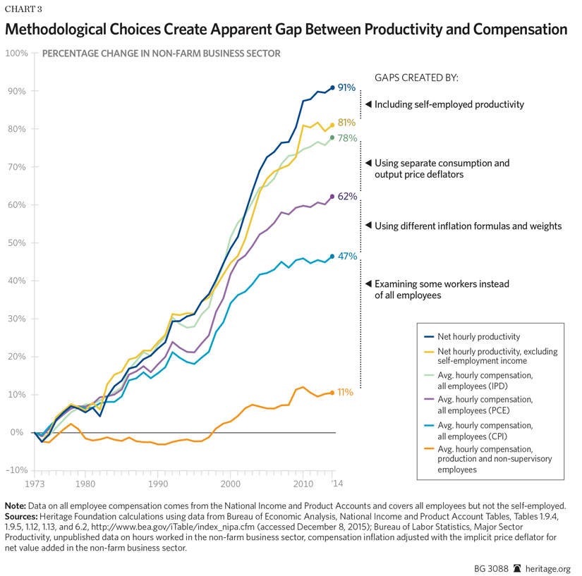
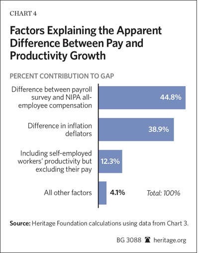
Chart 4 breaks down the proportionate contributions to the claimed gap between productivity and compensation. The difference between payroll-survey-based compensation covering a subset of the workforce and NIPA data on all business employees explains 45 percent of the gap. Counting the productivity growth of the self-employed while excluding their pay growth explains 13 percent of the gap. Using different methods to measure inflation explains 39 percent.[37] These three factors account for all but 4 percent of the apparent gap between pay and productivity. Over the past generation, employees’ compensation has risen in step with their productivity.
Evidence from Labor Share of Income. Data on workers’ share of income shows this clearly. A large increase in productivity coupled with stagnant compensation would cause workers’ share of overall income to drop dramatically. Prominent liberal economist Paul Krugman once made this point memorably:
Now what should [Michael] Lind have done before publishing this passage [stating that pay and productivity have diverged]? He should have had an internal monologue—something like this: “Hmm, do these numbers make sense? Well, historically, compensation of workers has been around 70 percent of national income. So let’s say that initially, output per worker is 100, and the wage is 70. Now if productivity is up 30 percent, that means that output is 130, while if wages are down 13 percent, that brings the wage down to around 61, which is less than half of 130—wow, that means that the share of labor in national income must have fallen more than 20 percentage points. Let me check that out in the Statistical Abstract....” Of course, if he had, he would have found out that the share of compensation in national income, far from declining 20 percentage points, was about the same (73 percent) in 1992 as it was in 1977, offering a clear warning bell that something was wrong not only with his numbers...but with his story.[38]
On this point Krugman is correct. Chart 5 shows the proportion of total income in the non-farm business sector earned by employees (instead of business owners).[39] The chart shows income after netting out the effects of depreciation and excludes self-employment income from both employee compensation and total income.[40]
Between 1973 and 2008, the labor share of income changed little. In 1973, workers claimed 70.0 percent of net income in the non-farm business sector; in 2008 they claimed 70.9 percent. Then the labor share of income dropped by roughly 2 percentage points during the Great Recession and subsequent weak recovery.
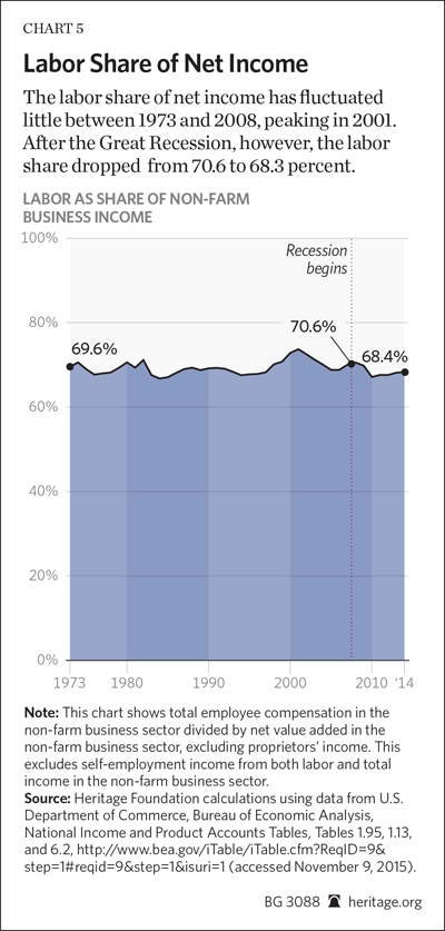
If employers stopped paying workers according to their productivity, the labor share of income should have dropped sharply since the mid-1970s.[41] Instead, the labor share of income remained relatively constant for most of that period.[42] Employers compensate employees for their productivity.
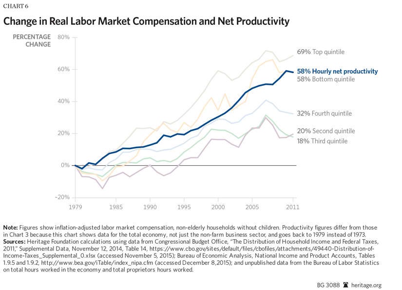
Unequal Productivity Growth. Nonetheless many workers’ earnings have grown at less than the average rate of productivity growth. Chart 6 shows Congressional Budget Office (CBO) data breaking down annual household labor compensation by income quintile, and showing productivity growth in the total economy. The productivity and compensation figures are not precisely comparable because they compare annual labor market earnings to hourly productivity, and include households without workers. However, they do provide a sense of how total compensation has changed throughout the workforce. (To mitigate the effects of demographic changes on earnings Chart 6 shows the income of non-elderly households without children.)[43] The CBO does not disaggregate earnings data by private sector versus government, so the chart displays productivity data for the entire economy.[44]
Across the overall economy, productivity has increased by 58 percent since 1979.[45] Household labor compensation has also grown—but at quite different rates across the income distribution. Labor compensation in the bottom quintile grew by 58 percent; almost exactly in pace with productivity growth. Average compensation in the top quintile grew somewhat faster—by 69 percent. But average compensation in the second, middle, and fourth quintiles grew much less than average productivity—by 20 percent, 18 percent, and 32 percent, respectively.[46] Pay closely tracks productivity across the economy. But many workers’ pay has grown at less than the average rate of productivity growth.[47]
Contrary to the arguments that unions and their allies make, the divergence between some workers’ pay and economy-wide productivity growth has not happened because employers deprived workers of the fruits of their labor. Across the whole economy, pay matches productivity growth. Pay growth also tracks productivity growth within industries.[48] Rather, changes in the economy have increased the relative value of some skill sets more than others. Relative demand has dropped sharply in routine occupations, such as for secretaries and manufacturing assemblers. Computers have automated many of the tasks that human workers in those jobs used to perform.
At the same time, demand has increased in non-routine jobs that machines cannot do. Workers with the skills needed to use modern technology have become dramatically more valuable to employers. Workers with non-routine manual skills—such as nurses and home-care aides—are also in greater demand.[49] Consequently, pay has risen faster at the top and bottom of the income distribution than in the middle, where many of the jobs requiring routine skills exist.
Critics often correctly point out that median compensation has grown more slowly than average productivity, but they draw the wrong conclusions. The economy does not face a large “divergence between pay and productivity.”[50] Rather, productivity has not risen as fast among some groups of workers. Policymakers do not need to “reconnect” productivity growth and pay. Rather, they should look for ways to help workers become more productive. Market forces will then force employers to increase compensation. Policymakers can do this in two main ways: helping workers increase their skills and reducing barriers to using their existing skills productively.
Increasing skills. Better-educated and more-skilled workers earn higher pay. Unfortunately, the K–12 education system does not adequately prepare many students for the modern workforce. The costs of higher education then often impose a crushing burden on many family budgets. Federal and state policymakers can take many reforms to fix these problems and help tomorrow’s workers become more productive:
-
Reforming K–12 education. Too many American schools fail to prepare their students for the modern workforce. One-fourth of U.S. 12th-graders read below a basic level.[51] One in seven American adults is functionally illiterate.[52] Anyone lacking basic reading skills will have great difficulty getting ahead. Union job protections make it prohibitively difficult for schools to remove ineffective teachers. Economists have found that replacing the 5 percent to 8 percent of least-effective teachers with average-quality teachers would dramatically increase the lifetime earnings of their students.[53] States should immediately end education policies, such as extremely onerous firing procedures, that serve the adults who run public schools at the expense of the children who need to learn.
-
Expanding access to charter and private schools. Education savings accounts and charter schools expand educational options, enabling parents to send their children to schools better suited to them. This makes them more productive workers as adults. Researchers find that students who have scholarships for private schools or who attend public charter schools are much more likely to graduate from high school.[54] A Mathematica study also found that attending charter schools increases children’s earnings as adults. The researchers found that Florida youth who enrolled in charter high schools earned an average of 12.7 percent more—greater than $2,300 per year—when they reached their mid-20s than their counterparts who attended standard public schools.[55] Improving education makes workers more productive, which raises their earnings.
-
Reducing the cost of higher education. Technology has made non-routine cognitive, social, and analytical skills more important than ever before. A college degree has become a prerequisite for many high-paying jobs. This development has dramatically increased the demand to attend college over the past generation, while the supply of college openings has increased only modestly. Federal accreditation requirements make starting a new school very expensive. This combination of rising demand and limited supply has combined to send college tuition costs surging. The government should reform accreditation to increase access to college education, while ensuring that state regulators do not stop low-cost innovations, such as massively open online courses (MOOCS), which could make education dramatically less expensive.[56] Lower costs would facilitate gaining the skills and productivity that enable workers to earn more.
Allowing workers to use their skills. Reforming the U.S. education system to help students learn more effectively would make them more productive workers as adults, but such reforms would address only part of the problems in the labor market. Employers do not need every worker to have a college degree. Moreover, going back to school makes little sense for many workers. Policymakers can further improve the labor market by creating new opportunities for workers to use their existing skills more productively. Such policies include:
-
Breaking down licensing barriers. One-third of jobs in the economy now require a government license to perform.[57] For some of these jobs—such as for surgeons and pharmacists—these licenses protect consumer safety. But many jobs require licenses despite virtually no safety concerns. For example, every state in America requires barber licenses. Half of U.S. states license African American hair braiders.[58] Four states license interior designers. These licenses are often onerous—the average state requires barbers to study for over a year before they can work.[59] Trade associations lobby for these licenses in order to restrict competition. This keeps many workers out of jobs in which they could excel.
States should replace most occupational licenses with certification systems. Under a certification system, practitioners can complete criteria to advertise themselves as government-certified. However, certification does not prevent uncertified practitioners from working. They simply cannot advertise themselves as such. Certification eliminates the labor cartel that occupational licenses create while providing a signal of quality to consumers. The government should only license occupations with pressing health or safety risks. This would expand the job opportunities available to workers with routine skills displaced by modern technology. It would enable them to move into jobs in which they can use their existing skills more productively.
-
Allowing permissionless innovation. New innovations are creating jobs for tens of thousands of Americans. Food trucks have enabled Americans without the capital to open a brick-and-mortar restaurant to start their own restaurants. Uber has enabled many ordinary car owners to make tens of thousands of dollars outside their regular jobs.[60] Airbnb allows Americans to rent their homes while they are away. Such innovations enable workers who might otherwise face bleak job prospects to get ahead. Existing businesses do not like the competition. Restaurant associations have heavily lobbied local governments to zone food trucks out of existence. Taxi associations have successfully persuaded some cities, including Seattle and Miami, to ban Uber. Hotels have lobbied to restrict the use of Airbnb. Americans should not have to obtain their competitors’ permission to work, and the government should stop suppressing disruptive innovations that have enabled many workers to get ahead.
-
Expanding domestic energy production. Oil and natural gas drilling requires extensive non-routine manual labor. Many workers displaced from factories or the construction sector could earn a good living in the energy-extraction sector. America has trillions of dollars’ worth of oil and natural gas, but federal policy has locked vast quantities of these resources away from production. Congress should open more federal lands to oil and natural gas production, while requiring regulatory agencies to quickly approve permits for new oil and gas pipelines and liquid natural gas export terminals. This would create hundreds of thousands of new, relatively high-paying blue-collar jobs for workers with manual skills.
Such reforms would help workers to become more productive and allow them to use their existing skills more productively.
Conclusion
Economists from across the political spectrum agree that businesses pay their workers according to their productivity. Since 1973, employee productivity has grown 81 percent and average compensation has increased 78 percent. Nonetheless, some analysts produce studies showing that pay and productivity have diverged since the 1970s. These studies (1) compare the productivity and pay of different groups of employees; (2) count the productivity growth but ignore the compensation growth of self-employed workers; and (3) use different measures of inflation when calculating pay and productivity. These methodological flaws are responsible for the apparent gap. Comparing the same groups of workers and using the same measure of inflation shows that pay growth closely tracks productivity growth.
The key challenge facing policymakers is helping workers to become more productive. To do so, policymakers should pursue educational reforms that enable workers to acquire skills more easily. They should also remove barriers, such as excessive occupational licensing, that prevent workers from using their existing skills productively. Such reforms would address the actual problem underlying slower pay growth in some sectors of the workforce.
—James Sherk is a Research Fellow in Labor Economics in the Center for Data Analysis, of the Institute for Economic Freedom and Opportunity, at The Heritage Foundation.
Appendix A: Methodological Errors in Research Finding a Productivity-Pay Gap
Researchers have paid increasing attention to the question of how best to compare productivity and compensation growth. Researchers across the political spectrum now agree on some of the analytical choices involved. For example, virtually all researchers agree on the importance of including total employee compensation—not just cash income. Similarly, there is growing recognition of the importance of examining productivity growth net of depreciation so as to focus on production growth that is available for consumption.[61]
Nonetheless, a recent Economic Policy Institute (EPI) report arguing that pay and productivity have diverged contained several methodological errors.[62] EPI made assertions that are factually untrue and used data incorrectly. These errors materially affect EPI’s conclusions. To assist other researchers examining these questions, The Heritage Foundation’s Center for Data Analysis (CDA) catalogues these errors here.
1. Price differences do not explain the difference between the CPI-U-RS and output deflators. EPI researchers use different inflation deflators to adjust productivity and pay for inflation. The difference between them drives a significant portion of the gap between pay and productivity they report. EPI argues that differences in inflation growth rates reflect differences in the prices of goods that Americans consume versus those that they produce. As EPI president Lawrence Mishel and researcher Joshua Bivens write:
A third wedge important to examine…is the “terms-of-trade” wedge, which concerns the faster price growth of things workers buy relative to the price of what they produce. This wedge is due to the fact that the output measure used to compute productivity and net productivity is converted to real, or constant (inflation-adjusted), dollars based on the components of national output (GDP), while the compensation measures are converted to real, or constant, dollars based on measures of price change in what consumers purchase. Prices for national output have grown more slowly than prices for consumer purchases.…
The fact that the CPI-U-RS has grown faster than the IPD in recent decades simply means that prices of goods and services consumed by households have risen more rapidly than a basket of output in the IPD.… [T]he differential behavior in the IPD and the CPI-U-RS is a real characteristic of the data reflecting the actual dynamics in the economy, not a statistical illusion.[63]
This statement is incorrect. Consumer prices and total economy output prices have grown at almost the same rate. The CPI rises faster than the total-economy IPD for methodological reasons: It uses a fixed-basket methodology instead of a chained methodology to estimate inflation, and it uses expenditure weights derived from the Consumer Expenditure Survey instead of from sales data.
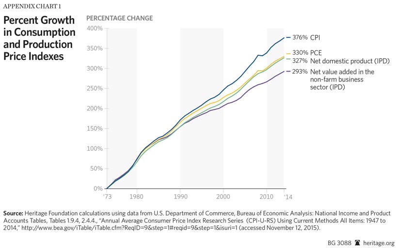
The Bureau of Economic Analysis produces a consumer price deflator that uses the same methodology as the IPD, applied to consumption goods—the Personal Consumption Expenditure (PCE) price index. The PCE reports inflation rates virtually identical to the output-price-based IPD.
Appendix Chart 1 shows this visually. It displays the growth of prices since 1973 reported by four different inflation measures: (1) the Consumer Price Index research series, (2) the PCE price index, (3) the IPD for Net Domestic Product, and (4) the IPD for net value added in the non-farm business sector. The total economy output price deflator and the consumer price deflator grow at nearly the same rate.
The IPD and the PCE do diverge for the subset of the economy contained in the non-farm business sector. The non-farm business sector excludes several sectors covered by the PCE where prices grew considerably faster than the economy-wide average: government expenditures on behalf of individuals, nonprofit institutions serving households (NPISH), and the rent implicit in owner-occupied housing.[64] Consequently, the non-farm business IPD has grown more slowly than either the total-economy IPD or the PCE.
However, EPI examined the total economy. For the total economy, the differences between the CPI and both the PCE and IPD are driven entirely by methodological differences.[65] It is erroneous to call this divergence “terms of trade” or “real characteristics of the data.”
2. Including health care and nonprofits increases PCE inflation rates. Virtually all economists—including those at the Economic Policy Institute—agree that a chained index (such as the PCE and IPD) measures inflation more accurately than a fixed-basket inflation index (such as the CPI). EPI nonetheless uses the CPI on the basis that the PCE includes goods and services not directly relevant to consumer welfare: third-party health care spending and the expenditures of some nonprofit organizations. EPI argues that including these sectors causes the PCE to understate the true inflation rate, so it prefers the CPI. As Josh Bivens and Lawrence Mishel write, the PCE
has the advantage that it is “chained” to account for substitution bias. This chaining means, all else equal, that it will show a slower rate of inflation than the CPI-U-RS. However, the chained aspect of the PCE only explains about a third of the average annual difference between the CPI-U-RS and the PCE. The remainder of the difference highlights some possible disadvantages with uncritically adopting the PCE as the deflator.
For example, the PCE deflator includes not just consumption costs faced by households but all consumption purchases made in the United States, regardless of whether the payer is a household. So, for example, health care costs that are borne by governments or employers are included in the PCE. And the costs of rent paid by nonprofit organizations are also included in the PCE deflator, as are computers and associated equipment purchased by them. As the price of rent has generally risen faster than overall prices and the price of computers has plummeted in recent decades, this leads to slower price growth in the PCE, but this is not necessarily accurately reflecting the living standards of typical American households.
Given all of this, it seems to us that the virtues of the CPI-U-RS outweigh those of the PCE deflator, and this is what we use in our work.[66]
This argument is erroneous. Including additional medical spending and including nonprofit expenditures leads to faster price growth in the PCE. If the PCE excluded them, it would report even slower inflation growth relative to the CPI than it currently does.
Economists at the Bureau of Economic Analysis (BEA) and the Bureau of Labor Statistics (BLS) publish a detailed reconciliation of the difference between the two inflation indices. They decompose the difference into four components:
- A formula effect caused by using a chained instead of a fixed-basket methodology;
- A weight effect caused by goods and services with different relative importance in the two surveys;
- A scope effect reflecting the two surveys covering different goods and services;
- All other differences.
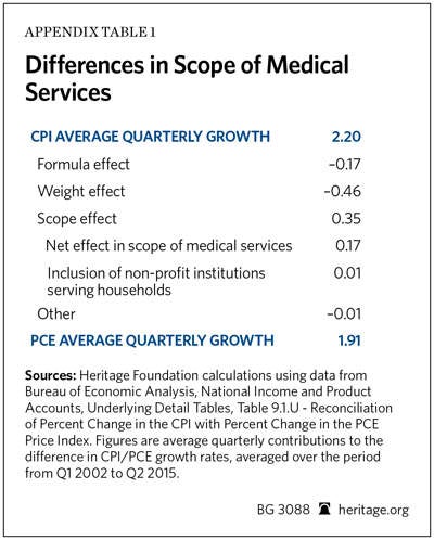
The BEA regularly publishes and updates this reconciliation. Appendix Table 1 shows the average contributions of these factors to the difference in PCE and CPI inflation between 2002 and 2015. Over this period, the CPI reported 0.29 percentage points faster average annual inflation than the PCE. The CPI grew at 2.20 percent a year, while the PCE grew at 1.91 percent a year.
About three-fifths of this net difference—0.17 percentage point—comes from the formula effect. The weight effect reduces PCE inflation by another 0.46 percentage point. The scope effect acts in the opposite direction: Including additional goods and services increases PCE inflation by 0.35 percentage point a year.[67]
The nonprofit and third-party health care expenditures that concern EPI added 0.18 percentage point a year to PCE inflation rates.[68] Including them causes the PCE to report faster—not slower—inflation. Intuitively, health care prices and nonprofit expenditures have grown faster than the overall inflation rate. The PCE’s expanded scope thus increases the inflation rate it reports.
The PCE uses a superior chained formula and uses more accurate weights to measure consumer spending. As a result, it reports lower inflation than the CPI. The PCE would report even less inflation if its scope were restricted to the goods and services EPI considers appropriate. The expanded scope of the PCE offers no reason to use the upwardly biased CPI. Doing so inaccurately increases measured inflation and decreases estimated real-wage growth.
3. Wages grew differently in the goods-producing sector and overall private sector. The BLS collects wage data for production and supervisory employees in the private sector from 1964 onwards. Between 1948 and 1964, the BLS collected wages only in the goods-producing sector (such as manufacturing and construction). EPI combined these two data series to create an hourly wage measure going back to 1948. EPI argues that the two surveys cover generally similar groups of workers. As Bivens and Mishel explain:
The most recent series of average hourly earnings for production/nonsupervisory workers (available from the BLS Current Employment Statistics [CES]) extends from 1964 to the present. Prior to 1964, the series of average hourly earnings of production workers (also available from the BLS CES) measured the earnings of a similar pool of workers. We backcast the average hourly earnings of production/nonsupervisory workers from 1964 to 1948 using the percent changes in the average hourly earnings of production workers.[69]
This statement is incorrect. Goods-producing workers constituted less than two-fifths of all workers in the economy in 1964.[70] They differed noticeably from workers in the rest of the private sector. In the mid-1960s, production employees worked longer hours and were disproportionately male relative to service-sector workers.[71] In the post-1964 period, production-employee wages also grew faster than service-sector workers’ pay.
Appendix Chart 2 shows hourly payroll-survey earnings for production employees in the goods-producing sector and the overall private sector (inflation-adjusted with the PCE). From 1964 onwards, wages grew noticeably faster in the goods-producing sector than in the overall private sector. EPI provides no reason to believe this did not occur before 1964 as well.
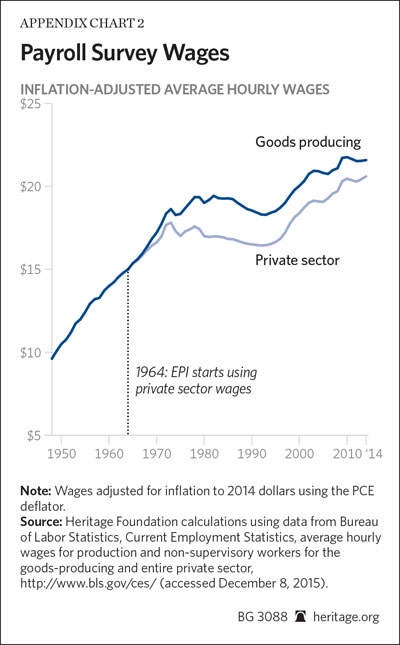
EPI uses a historically inconsistent amalgamation of wages for different groups of workers to measure employee compensation. It uses a faster measure of wage growth until the mid-1960s, then switches to a measure showing slower wage growth. This contributes to EPI’s conclusion that compensation growth slowed after the 1960s. The payroll survey is a problematic measure of historical wages; combining wage data for different workers makes it even less reliable.
4. Real variables calculated with different chained price indices are not additive. The payroll survey reports hourly wages. EPI estimated workers’ total hourly compensation—including non-cash benefits, such as health care—by multiplying these hourly wages by the economy-wide compensation-to-wage ratio.[72] This approximates workers’ change in total compensation. However, EPI makes a mathematical error in calculating the compensation-to-wage ratio. This error causes EPI to understate the growth of employee benefits and thus the growth of total compensation.
The BEA recommends calculating figures such as the wage share of compensation using current dollars (unadjusted for inflation). The BEA website warns of adding inflation-adjusted values measured with different chained-price indices. The math simply does not work; the figures will not add correctly. As the BEA website cautions:
[C]omparisons of two or more different chained-dollar series must be made with caution, because the prices used as weights in the chained-dollar calculations usually differ from the prices in the reference period, and the resulting chained-dollar values for detailed GDP components usually do not sum to the chained-dollar estimate of GDP or to any intermediate aggregate.… It is usually best to make comparisons of aggregate series in current dollars or to use BEA’s estimates of contributions to percent change.… In general, the use of chained-dollar estimates to calculate component shares or component contributions may be misleading for periods away from the reference year.[73]
Nonetheless, EPI did this when calculating the compensation-to-wage ratio. Bivens and Mishel adjusted all employee compensation except health benefits for inflation with the PCE index. They adjusted health benefits for inflation with the separate PCE sub-index for medical prices.[74] They then added these together to estimate real total compensation and divided this figure by real wages and salaries.[75]
This does not work. As the BEA explains, real variables calculated with different chained-price indices do not sum together and will produce misleading estimates. The sum has no real-world interpretation. Such calculations are particularly erroneous when the price of one component (such as health care spending) has grown disproportionately faster than the other. As a Federal Reserve economist warned researchers:
A crucial feature of this chain aggregation methodology is that the real aggregate of X and Y will generally not equal the arithmetic sum of the real series for X and Y.… Moreover, this feature applies most noticeably when we are dealing with categories undergoing large changes in relative prices.[76]
Adding figures calculated with different chained price indices will significantly understate the growth of the item that rose in price—in this case, health care benefits. Consequently, EPI understates the growth of employee benefits.[77] It reports that the proportion of compensation going to benefits rose 1.4 percentage points between 1979 and 2014.[78] Calculated correctly it rose 4.0 percentage points—almost three times as much.[79] Consequently, EPI understates total compensation growth by approximately 3 percentage points over this period independent of any other problems with using the payroll survey to estimate wages.[80]
5. Industry-level productivity substantially affects industry compensation growth. The Economic Policy Institute argues that the Baumol effect means that workers’ wages grow independently of industry-level productivity. As EPI contends:
[E]conomic theory is clear that industry-level productivity bears no relation to the wages that individual workers should expect to receive, precisely because labor market competition will (roughly) equalize the wages of similarly productive workers across industries…. [W]e show empirically that there has not been a close correspondence between industry-sector productivity growth and sector compensation growth across sectors in either the 1948–1973 or 1973–2014 periods.[81]
This claim is empirically false. Industry-level productivity growth correlates strongly with compensation growth—as long as researchers do not use different price indices to adjust them for inflation. Appendix Chart 3 demonstrates this visually, displaying the log change in workers’ hourly real compensation and productivity between 1987 and 2013. On average, a one log point increase in an industry’s productivity correlates with a 0.43 log point increase in hourly compensation in that industry. Changes in industry-level productivity explain over 40 percent of the variation in industry-level pay over that period.[82]
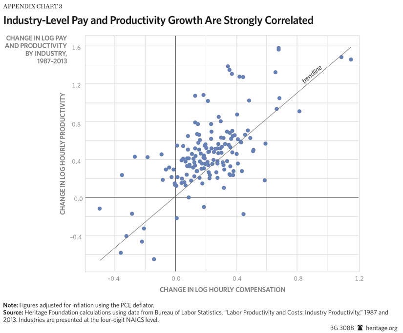
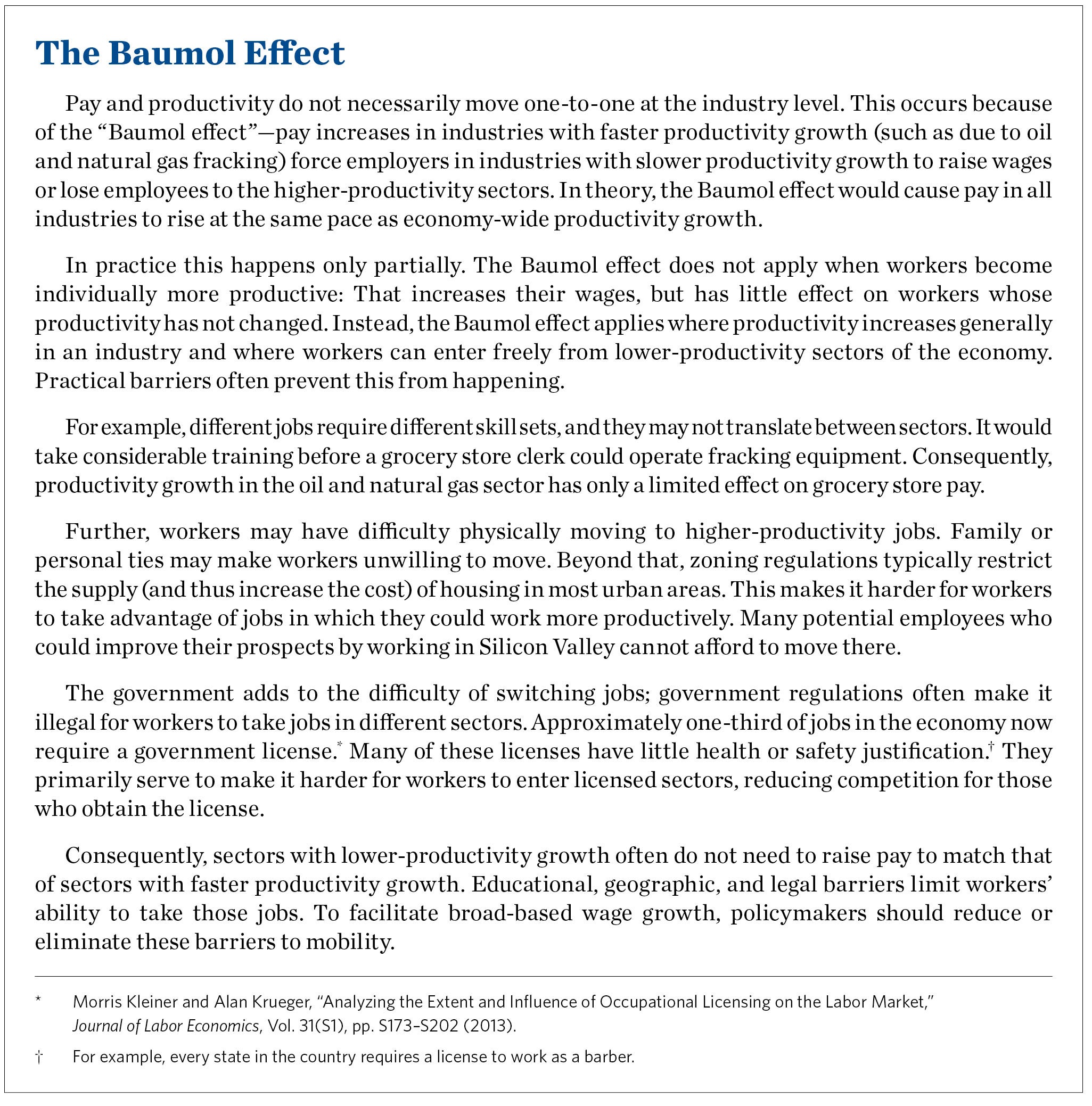
The Baumol effect occurs, but it is not an iron law. Many factors prevent workers from switching from low-productivity jobs to higher-productivity ones. They may not have the skills necessary to work in the higher-productivity jobs. Family concerns or real estate prices may prevent them from moving within commuting distance. Occupational licensing requirements may legally bar them from entering a field in which they could work more productively. As a result, many employers in high-productivity industries primarily search for employees already in their industry. Most barbers in Ohio do not have the option of moving to Silicon Valley and working for a tech firm. Rising productivity in the tech sector thus has little direct effect on their wages.
6. Employee compensation need not follow other workers’ productivity. EPI often argues that its graphs show that employers do not pay workers according to the value they themselves produce. For example:
- EPI President Lawrence Mishel writes that “workers have been producing far more than they receive in their paychecks and benefit packages from their employers.”[83]
- Former EPI President Jeffrey Faux argued that “the forty-year gap between wages and productivity refutes the theory that workers get paid according to their efficiency.”[84]
- EPI staff write that “workers are working more, making more goods, and not reaping the rewards of their increased productivity. Instead, CEOs and executives—the top 1% of earners—now take home 20% of the nation’s income.”[85]
EPI cannot draw this conclusion from the data it presents. EPI does not attempt to compare the pay and productivity of the same employees.
EPI compares compensation for production and non-supervisory employees—which covers about five-eighths of the total economy—to the productivity of all workers in the economy. Economic theory does not predict that the pay and productivity of different groups of employees will necessarily track each other, especially in the presence of barriers to mobility.
Even abstracting from analytical errors, EPI can claim no more than that pay and productivity have grown differently among different groups of workers. EPI’s data say nothing about whether workers’ pay has grown in step with their own productivity.
Appendix B: Data and Methodology
This section explains the data sources and methodology used in creating the charts displayed throughout the Backgrounder.
Hourly Non-farm Business Compensation. The National Income and Product Accounts (NIPA) do not directly report data on compensation in the non-farm business sector. Bureau of Economic Analysis staff explained how to construct non-farm business compensation from the publicly released NIPA Tables.[86] CDA analysts followed these directions to calculate total non-farm business-employee compensation. This involved taking the compensation of employees, domestic industries (NIPA table 6.2, line 2) and subtracting from it:
- Farm compensation (Table 6.2, line 5);
- Federal general government compensation (Table 6.2, line 88);
- State and local general government compensation (Table 6.2, line 93);
- Compensation, households (Table 1.13, line 43);
- Compensation, institutions (Table 1.13, line 50).
This measure of non-farm business compensation excludes proprietors’ income and includes employees in government enterprises producing goods and services sold in the market (such as the U.S. Postal Service). The CDA used NIPA-based non-farm business compensation data instead of BLS data because the BLS data imputes a portion of proprietors’ income to labor, preventing the analysis of self-employment and employee income separately. Additionally, BLS changed how it imputes proprietors’ income in the early 2000s and now attributes substantially less self-employment income to labor than before.
BLS calculates detailed unpublished information on hours worked in the economy. BLS has recently begun releasing this information online.[87] CDA analysts estimated hourly compensation by dividing non-farm business-employee compensation by private-employee and government-enterprise-employee hours worked in the non-farm business sector.
Charts 1 and 3 and Tables 1–5 in the main text of this Backgrounder show the growth in hourly non-farm business-employee compensation, inflation-adjusted using the implicit price deflator for net value added in the non-farm business sector (NIPA Table 1.9.4, line 3). Chart 3 and Tables 1–5 also show the growth of this hourly compensation series inflation-adjusted with the Consumer Price Index Research Series (CPI-U-RS) and with the Personal Consumption Expenditures price index (Table 2.4.4, line 1).
The total-economy all-employee compensation data in Appendix Chart 4 show the growth in total compensation (NIPA Table 6.2, line 1) divided by total non-proprietor hours worked from the BLS data, inflation-adjusted with both the CPI and IPD for net domestic product.
Hourly Payroll Compensation. The BLS Current Employment Statistics survey (CES, also known as the payroll survey) estimates hourly wages for private-sector production and non-supervisory employees from 1964 onwards. The CES does not estimate total compensation, which includes benefits. For the payroll compensation data presented in Chart 3 and Tables 1–5, CDA analysts followed a methodology similar to that used by Bivens and Mishel to impute total compensation from hourly wages. CDA analysts multiplied average hourly wages by the non-farm business sector compensation-to-wage ratio. This ratio consists of total compensation in the non-farm business sector divided by total wage and salary disbursements in the non-farm business sector.[88] The CDA performed this calculation using current dollars and adjusted the resulting hourly compensation series for inflation using the CPI-U-RS. This calculation excluded sole proprietors’ income.
For the total economy payroll compensation measure in Appendix Chart 4, CDA analysts multiplied the payroll survey wages by the total economy compensation-to-wage ratio (NIPA Table 6.3, line 1 divided by Table 6.2, line 1).
Hourly Net Productivity. CDA analysts calculated net productivity (as shown in Charts 1 and 3 and Tables 1–5) by dividing annual net value added in the non-farm business sector (Table 1.9.5, line 3) by the total hours worked in the non-farm business sector reported in the Bureau of Labor Statistics unpublished data. This figure was adjusted for inflation using the implicit price deflator for net value added in the non-farm business sector (Table 1.9.4, line 3).
Hourly Net Productivity, Excluding Self-Employment Income. CDA analysts calculated net productivity excluding self-employment income in the non-farm business sector (as shown in Charts 3 and Tables 1–5) by subtracting non-farm proprietors income (Table 1.12, line 11) from net value added in the non-farm business sector (Table 1.9.5, line 13). They divided this series by the BLS estimates for employee hours worked in the non-farm business sector in businesses and government enterprises. The CDA analysts inflation-adjusted this series with the implicit price deflator for net value added in the non-farm business sector (Table 1.9.4, line 3).
Total economy net productivity (as in Appendix Chart 4) refers to net domestic product (Table 1.9.5, line 1). For total-economy net productivity, excepting self-employment income (as in Appendix Chart 4), CDA analysts subtracted total proprietors’ income (Table 1.12, line 9) from net domestic product. They divided these measures by the BLS measure of total economy hours and total economy hours excluding those worked by farm and non-farm proprietors, respectively. CDA analysts adjusted productivity for inflation in Chart 6 using the PCE index (Table 2.4.4, line 1). The Congressional Budget Office uses the PCE index to adjust household income for inflation, and it reports inflation rates almost identical to the implicit price deflator for net domestic product (Table 1.9.4, line 1). In Appendix Chart 4, CDA analysts adjusted productivity using the IPD for net domestic product.
Industry-Level Productivity and Compensation. For the data presented in Appendix Chart 3, the CDA obtained industry-level productivity and compensation figures from the BLS’s “Industry Productivity” data.[89] CDA analysts calculated the log change in total compensation (series code L02) and total value of production (series code T30), both divided by total hours (series code L20), between 1987 and 2013. All figures were inflation-adjusted with the PCE deflator. Figures presented at the 4-digit NAICS level.
Self-Employment Income Share. CDA analysts calculated the self-employment share of net income in the non-farm business sector (as shown in Chart 2) by dividing non-farm proprietors’ income (Table 1.12, line 11) by net value added in the non-farm business sector (Table 1.9.5, line 3).
Labor Share of Net Income. CDA analysts calculated the labor share of net income by dividing nominal non-farm business employee compensation (as described above) by nominal net value added in the non-farm business sector, excluding non-farm proprietors’ income (as described above). This excludes the effects of both depreciation and rising self-employment income.
Household Labor Market Income. The Congressional Budget Office reports data on household income and market income by quintile.[90] The data in Chart 6 show the growth in labor income by quintile. CDA analysts calculated this from CBO data by multiplying each quintile’s average-market compensation by the percentage of market compensation earned through labor activities. This consists of cash wages and salaries, employees’ contributions to deferred compensation plans, employer contributions to health insurance, employers’ share of payroll taxes, and the CBO’s estimates of the incidence of the corporate tax borne by labor.
Appendix C: Total Economy Figures
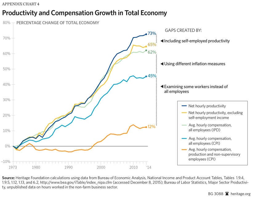
This report focused on the non-farm business sector because prices do not meaningfully exist in the government and nonprofit sectors of the economy; they do not sell goods and services in the market. The charts showing a gap between pay and productivity typically show the total economy (a choice that reduces the gap they display). Appendix Chart 4 shows the growth in pay and productivity across the total economy sector. This chart is directly comparable with Figure C in Bivens and Mishel (2015).
Payroll-survey-based compensation has risen 12.4 percent since 1973, adjusted for inflation with the CPI.[91] Looking at the compensation of all employees increases compensation growth to 45.2 percent. Adjusting for inflation with the IPD for net domestic product further increases average compensation growth to 62.1 percent. Net productivity in the total economy has grown 72.6 percent since 1973. Productivity exclusive of self-employment income has grown 66.4 percent. Compared on an apples-to-apples basis, productivity has grown only 4.3 percentage points faster in the total economy than hourly compensation.
Appendix D: Price Indices Measuring Inflation
Consumer Price Index
The Bureau of Labor Statistics (BLS) calculates the Consumer Price Index (CPI) to measure the inflation that consumers experience in their daily life. It uses a Laspeyres methodology; that is, the BLS fixes the composition of a basket of goods that the average consumer purchases in a base year and measures how the prices of the goods in that basket change over time. This methodology fails to account for changes in consumers’ consumption patterns as prices shift, also known as “substitution bias.” For example, as iPads became less expensive, consumers purchased more of them. iPads would thus come to take up a larger share of the average consumer’s basket of goods, but the Laspeyres methodology ignores this effect.
The formula for computing a Laspeyres price index is
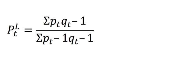
where pt and qt represent the prices and quantities in year t, respectively.
Personal Consumption Expenditures and Implicit Price Deflator Indices
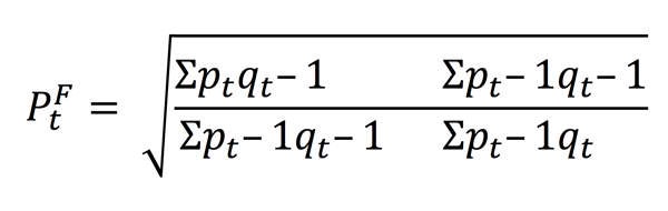
To overcome this problem, the Bureau of Economic Analysis uses a Fisher chain formula to calculate the Personal Consumption Expenditures (PCE) price index and the implicit price deflator (IPD) for non-farm businesses.[92] A Fisher chain formula takes the geometric mean of the Paasche and Laspeyres price calculations. The Paasche formula is a mirror image of the Laspeyres formula. A Laspeyres index fixes the basket of goods in a base year. A Paasche index fixes the basket of goods in the current year and compares the price in the present year to that of earlier years. By taking the geometric average of these formulas, a Fisher chain index accounts for the change in consumers’ consumption patterns between years. This more accurately reflects changes in purchasing power.
The formula for a Paasche price index is
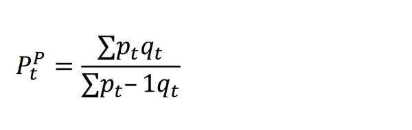
where pt and qt represent the prices and quantities in year t, respectively. The Fisher chain price index is calculated by taking the geometric mean of the Laspeyres price index and the Paasche price index:

or
For more details, see Bureau of Economic Analysis, “Concepts and Methods of the U.S. National Income and Product Accounts,” Chapter 4, October 2009, http://www.bea.gov/national/pdf/NIPAhandbookch1-4.pdf (accessed November 24, 2015).
A Fisher chain price index will typically estimate lower inflation than a Laspeyres index, given the same underlying price and quantity data. This difference in formulas explains about three-fifths of the difference in inflation rates reported by the CPI and the PCE indices.